Quantcast
Channel: Ilaria Rosselli Del Turco - News
Viewing all 85 articles
Browse latest View live

Mi Blog Es Tu Blog- Daniel Shadbolt

$
0
0
If you read this blog you might know that I have met Daniel back in 2009, admire and collect his work and have sat for him as well as painted him. I am happy to host this blogpost just the day before the opening of a very comprehensive show of his painting at Gallery 286 in London.
I am excited to see his recent work since I have been following its progress and development in the last couple of years. The surface of his paintings is very rich and it is extremely satisfying seeing it in real life, so come see the show if you can !


Interior with green blind,  2014  oil on canvas   162 x 175 cm


WHO ARE YOU
   My name is Daniel Shadbolt, I am an English painter aged 33 and am living in London.  I have been painting full time since graduating from Chelsea school of art in 2003.  I received a bursary and a prize for drawing when I was at the Prince's drawing school in 2004, and received the Bulldog bursary for portrait painting in 2008/9 in connection with the Royal Society of Portrait Painters.  I have been employed to teach by the Prince's drawing school and most recently at the Heatherley school of fine art (since 2008).   
 
   I have had pictures in the BP portrait award (2002), the Lynn Painter Stainers award, the RSPP, the NEAC, and the ROI.  I was selected for the Ruth Borchard self portrait exhibitions in 2011 and 2013, and have also been invited to paint portraits at Art in Action in Oxfordshire this year and last year.  I have had solo exhibitions since 2001.

WHY THIS ONE
The painting I have chosen to reproduce here is the largest picture in my exhibition.

WHERE IS IT NOW
At my 'New Paintings' exhibition, opening on 6.30 - 8.30pm Tuesday 10th June 2014 at the 286 Gallery in Earls Court ( until the 30th of June)
 
SOMETHING ABOUT IT
I call it the Green Blind as that became a dominant colour surrounding the seated figure.  It has been mostly painted at night, but more recently had the daylight coming in under the blind.  I added self portraits to try to increase the depth of the image.  It has been made in part from drawings but essentially from life.  I started it in 2013 while I was on a residency at the Machin studio in Sydney Close.  It was a standing figure in front of a fireplace.   The composition had a large blank canvas.  This all changed when I tried to remake the nude figure from drawings.  There is a part of the picture that was full of prussian blue pigment (I had used all my ultramarine), which, when I tried to change the picture, would not come off easily - this led to the paint accumulating quite thickly... in an attempt to change the colour and stop the blue from coming through.   

WEBSITE
www.danielshadbolt.com


Here is one of three videos of the exhibition. More can be found here and here.


For more MBETB posts please click on the tab at the top of the page.

Facebook and I

$
0
0
Capture IV, oil on linen


Since the dawn of Facebook artists have found in it a mean for breaking the isolation of the studio, connecting with like-minded people worldwide and learning about artists of the past and the present. It is also an invaluable platform to show work and receive feedback and support.

   I spend ( too much) time on FB, where I receive and have received a lot from the online community of artists. If I look back I see that thanks to them my work has evolved and improved, particularly as I have looked at old masters with new eyes,  made virtual studio visits, perused online catalogues of their shows, read about materials and learnt how they go about in dealing with the commercial part of the job.


   My experience with FB is positive also because I try to be proactive and filter the content I receive. The website has its own agenda and of course it pushes viral videos and platitude memes on my newsfeed, so I mercilessly unfollow people who post too many of those ( dog videos are keepers though). I also bestow "likes" on lots of paintings in the hope the algorithm starts getting a clue on what I am interested in.  Although I look at FB on my phone when I'm in the studio I think it is better to check it on the laptop because on the right sidebar there's a lot more activity going on than what FB dispenses on the newsfeed.

   Posting has its rules too: I have learnt that some posts, for example when I share content from this blog, need to be shared more than once, depending on the time of day they were originally published.  
    Facebook by the way provides a lot of visitors to this page, however nowadays part of the traffic stops there.  I sometimes find it easier to publish on FB than write a blog post. If for example I take photos of a show and I don't want to sit and write a review, I'd only post them on FB.
I am sure that FB has generally intercepted a lot of traffic that used to go to blogs and websites, so some visitors to go through online FB albums rather than clicking through individual online portfolios, hence I think for artists it's a good idea to have a clearly labelled and updated album of works on their FB profile.


I only have one profile on FB: I decided not to have an artist page as I find it difficult to distinguish between people who are "real life" friends and people who are interested in my work, too many overlappings there and people would get lots of double posts. I wouldn't be able to stop some of my silliness from appearing in the pro page anyway.
 I must confess I don't hit the contact request button very often. I send friendship requests to or accept contact with people who post work I like and with whom I have mutual friends; although I have occasionally sold and bought work on FB, I am not there to sell nor to be sold paintings ( I unfollow pushy marketers), but I like to befriend people who dialogue openly on art, and I am often humbled by the level of the discussion.

Not everything is great on Facebook of course : censorship police is patrolling too zealously and many artists got warning and even bans simply for posting nudes. Privacy is an issue but I think there are ways, particularly if you don't click on yes to any single app who wants to gain access to your own data.
A recent change has also affected artists: images posted on FB now get processed and their resolution is drastically decreased. I think this is now a general trend on big websites, including  Blogger  here and on my webhost service, Weebly.
Once, when you clicked on images on this page you'd get to see them almost at the same resolution with which I originally uploaded them; not any more now,  there's just a smallish image viewer.
One website that goes against the trend is Tumblr, where image quality is very satisfying ( also there's no censorship at all, for the good or the bad).
I also have a Twitter account for quick updates but I find it is less suitable for painters because you have to click before viewing images. Also I am not very good at short sentences...

I hope I didn't sound too scary, please do befriend or follow me on Facebook if you wish.


To give a better sense of what my paintings look like in real life, this is a three minutes iphone video with close ups of the surfaces of my works.


Catherine Goodman - Portraits from Life at the National Portrait Gallery London

$
0
0
Right before the buzz of the BP Portrait Award the NPG has opened a new display featuring a series of portraits by Catherine Goodman, together with a a few of her drawings.
Since Goodman won the BP Award in 2002 she has exhibited regularly with galleries such as Marlborough and Colnaghi. She has helped found the Prince of Wales Drawing School, in which she has retained the high profile role of artistic director (the person who keeps the focus on the "art" part of the institution).


   The show at the NPG is intense and emotional. The portraits are almost all close ups, the head bigger than life size, the brushwork layered and energetic, respecting both the form and the surface of the canvas; the palette is rich with realistic skin tones punctuated by marks in saturated colour.


     There is only one large self portrait in the show, and is the only painting in which the viewer is confronted and looked at straight in the eyes. In all the other portraits the sitters' glaze is turned away, they seem to be staring directly at their own life.


  The show includes some very haunting drawings. In the last number of Intelligent Life ( quarterly magazine of the Economist) I read a beautiful article on Jean Vanier, the founder of L'Arche, a community for the mentally disabled that has now branches around the whole world. The article describes the deeply moving and life-changing experience of spending time as a volunteer in these houses and as I looked at Goodman's drawing made in one of L'Arche houses I found the same sentiment expressed in the pages of her sketchbook. While the large paintings expand and encompass a long span of time, the constrictive size of the paper and the instantaneous nature of the drawings compress emotions into these powerful works full of pain, compassion, love and respect.


  Portraits have always been at the core of British painting, and in recent years Hockney, Auerbach and Freud have taken the genre to both a highest artistic standard and a wide level of popularity.    Goodman follows in their steps with a, yes I'm stereotyping, womanly capacity of empathising with her sitters. As with Goodman, Freud and Auerbach required quite an extraordinary number of sittings for each portrait, some going on on for decades. I can't help feeling, looking at the paintings, that there is a process of subjugation going on there.
Freud's sitter look mostly gloomy and obliging, Auerbach's have their outside appearance obliterated as he explores their humanness. Goodman's sitter on the other hand seem to have a much more active if not democratic role in the work of art, which looks like a cooperation between two human beings rather than a long ordeal one is submitting the other to. The process result in a series of works that speak about painting, life, beauty, memories, engagement.


  I had the chance of meeting Goodman a few years ago. It was at a dinner party, so not the right place to ask lots of questions. Anyway it was soon after the 2010 BP show and she remembered my painting there. She said it looked "sladeish" ( as per the Slade School of art in London) but she didn't recognise my name as one of the students there. She had in fact correctly identified the influence of Uglow in my work, perhaps less strong now. She then asked me about my practice and I said I was painting still life and working from the model. At that point she said something that I have not really appreciated until later on, taken as I was by learning to paint the figure, she warned me against the objectification of women's body.
I hadn't paid much attention but then it became evident to me the danger of picking up, from Uglow's work, the way he painted girls like soul-less bodies, pieces of meat splayed on a table. I don't have many chances to paint the nude, but looking back I can see that my best portraits from models are done from those I have painted several times over the course of years, people I care for, and this now is something I pay attention to in my work and also in other artist's.


     Read the introduction to the show,  an interview with the artist and an essay by William Feaver here . It is clear from the sitters and the contributions to the show's catalogue that Goodman enjoys support from many prominent members of society, but her inspiring work and her dedicated art practice deserve to be more widely known and celebrated.


A quick look at the BP Portrait Award 2014

$
0
0


Finally getting round to publish a short post on the yearly BP Portrait Award Exhibition, now open at the National Portrait Gallery in London. This is one of the most competitive open exhibitions in UK with, this year, about 2400 entries.
The jurors have a vast choice for picking the exhibitors: only two paintings in a hundred make it to the walls of the gallery.

   Every selected work has all the reasons to be there and they are all very good paintings each in their own merit. I wanted to write about the selection as a whole and how the show generally looks.  I wonder if the presence of Jonathan Yeo in the jury has influenced the judging process overall as the exhibition looked more homogeneous than in previous years. 

   Most of the paintings can be classified as belonging to realism and photorealism. The “BP Big Heads” (over-sized close up portraits that have made a constant appearance in the show) have returned this year, but aside from those, most of the paintings on display are within a range of more tightly rendered works from photos to more “painterly” ones but still strongly rooted in realism.

    Probably as a consequence of the realism there is a distinctive lack of colour in the exhibition. Walking in the gallery I felt as the dreaded banning of cadmiums in Europe, that is tragically looming upon artist’s heads, was already in place.
It isn’t only the “classically” trained artists (it occurred to me in a recent conversation that a more accurate definition would be post-neoclassically trained), who normally don't use a very chromatic palette, but also among artists from different countries or schools there is a predominance of tonal paintings, earthy skin tones and neutral backgrounds (with exceptions of course), and pure colour basically appeares when there is an object or garment that is more chromatically saturated, when it is in fact a local colour. Matisse's portrait of his wife wouldn't have a place in the selection, to be clear.

   Another constant of the exhibition is that the sitter matters. Before the opening of the show the NPG released a video in which one of the jurors, the writer Joanna Trollope says that it wasn’t too difficult to see which portraits were about the painter more than the sitter.
 I like portraits that are equally about the painter, about the relationship among the two, about the artist’s vision of the world; however I felt that there are several paintings chosen either because of the celebrity status of the sitter or because of their quirky fashion sense, so works in which the sitter's identity is the most relevant element, and the criterium mentioned by Trollope doesn't seem to have had much of an impact on the selection.

To simplify the eternal painter's dilemma between form and subject ( who do you love more, mummy or daddy?) I ask myself, when considering a portrait : what if this was a photo of the same sitter in the same pose ? What does the fact that the portrait is a painting adds to the work, how is painting integral and essential to the piece?

Mumble, mumble


Mi Blog Es Tu Blog - Leslie Watts

$
0
0
I met Leslie Watts at the opening of the BP Award in June ( thank you Sophie Ploeg for inviting me). I was terribly flattered that she recognised me while I was having a closer look at her painting (she is a reader of this blog) !
Her portrait of son Stefan is incredible, one of the best entries this year. It's a work that gracefully dissimulates the extreme sophistication of its technique, a portrait that I find strong and melancholic at the same time. 
I want to thank Leslie, a lovely person I hope to meet again, for the very extensive post she wrote and the precious insight into her process and her pigments drawer.


Stefan, 23,
Egg Tempera on Panel, 20" x 16"


WHO ARE YOU
I am a painter living in Stratford, Ontario, Canada. I work in both egg tempera and acrylic. In addition to painting most of the time, I also have a dozen or so private students who come to my home for weekly art lessons in groups of two or three. I find that teaching helps me to articulate what I tend to do by instinct, and this helps me to become more aware of what I’m doing. Since I paint from photographs, awareness is a necessity.


WHY THIS PIECE
I painted this portrait of my son specifically to enter in the BP Award 2014. I’m working on a series of faux-16th century portraits, and I had originally intended to paint Stefan for that series, inventing a costume to replace his t-shirt. But when I looked through the photographs I’d taken of him, I realized that this pose, without any elaboration, seemed right for this year’s BP submission. It was a good combination of a traditional pose and setting and contemporary clothing. I have painted Stefan many times before, but this was the first time that I felt I was painting him as a man and not a boy.


WHERE IS IT NOW
It is hanging in the National Portrait Gallery in London as part of the BP Portrait Award 2014 exhibition.


SOMETHING ABOUT IT
Although 20" x 16" isn’t enormous, for an egg tempera painting it was large enough to keep me busy for five months. My first submission to the BP Award was accepted last year, and I wanted this year’s submission to be bigger and more complicated. Working from a digital photograph will only take you so far. You have to be very careful to interpret rather than copy. I never want my paintings to look like photos. For instance, I created a cool reflected light on the shadowed side of the face. This light isn’t in the photo, but without it, the face looked flat and not quite believable.

I have three rules for painting: follow the form; soften the edges; use reflected colours. These are all approaches that keep a painting from looking like a photograph. The last rule means thinking carefully about how colours bounce off one another. If the background is green, for instance, the reflected light on the subject will have a greenish cast. If you exaggerate this, you don’t end up with those orange faces that are so typical of literal copies of photographs. Each form within a painting should influence every other form with its own light and colour; and so I paint what an object does, and not what it is.
After I’d been working on this portrait for a month, I was frustrated by how poorly the face was working, so I washed it right down to the board with a scouring sponge and started again. I felt a bit sick after I’d done it, but it was the right thing to do.
Besides referring to photographs on my computer monitor, I also spent time Skyping with my son, who lives in Toronto, so I could correct the shapes that couldn’t be seen in a photo. And he was able to critique the painting from his end. The first time he saw it in real life was at the opening at the NPG.

TECHNICAL NOTES
The painting is done on Ampersand Claybord. I love the surface, which is extremely smooth and absorbent. It’s specifically made for tempera paints, and it saves a lot of time. I used to spend a lot of time preparing boards with traditional cooked gesso, but now I just remove the plastic wrapper and get on with painting.

I don’t mix egg tempera in the traditional way. Instead of grinding pigments with water and then adding egg yolk, I mix an egg yolk with six tablespoons of water in a small jar, which I keep in the fridge. I pour some of this into a small porcelain dish. To make paint, I dip a brush into the egg mixture, knock off the excess onto a rag, then quickly dip the brush into dry pigment. The pigment sticks to the brush without leaving any egg mixture behind. I mix the colour in a round porcelain watercolour palette. This is a spontaneous method; it allows me to be free in choosing my colours, one dip at a time, since I don’t have to plan ahead. With this method, there is little waste.
I have nearly sixty pigments in little plastic canisters, all open in a biscuit tin, and I used most of them in this portrait. I tend to use earth tones more than primaries, but while I was working on this painting, I discovered that cadmium green and cadmium red mixed together with white make an amazing and versatile skin colour. I use iridescent gold to bring warmth to white and depth to eyes. I usually add a bit of iridescent pearl to skin tones, just because I think it looks good.
I start by blocking in with large strokes, usually with a 1⁄2" flat brush, keeping the colours to a basic few. For the first while I’m worrying only about working out value and form. It takes a long time before the layers are built up enough to focus on detail. After awhile, the surface starts to feel different under the brush. As I get further along, I use smaller round brushes. I try to avoid the cross-hatched look. I want my pieces to look solid.
I like to buff the surface with a flannelette cloth as I work. This painting looks as if it’s been varnished or waxed, but that’s just what happens when you buff it. I usually give the painting a coat of clear egg and water mix first to seal the colours. But this really helps to refresh sunken colours, especially the darks.


BASIC PALETTE 
Titanium White
Raw and Burnt Sienna 

Raw and Burnt Umber 
Yellow and Golden Ochre 
Chromeoxide Green 
Terre Verte
Green Earth Light 
Iridescent Pearl 
Iridescent Gold 
Iron Oxide Black
Transparent Orange Oxide 
Transparent Yellow Oxide 
Venetian Red
Potter’s Pink

Cadmium Red Deep 
Cadmium Green


WEBSITE
www.lesliewatts.ca 


Il Libro Mio

$
0
0


"If by chance one is disorderly in exercise, in clothes, in coitus or superfluous eating, in a few days it can harm you or even doom you. So you should be prudent in June, July, August and mid September, sweat moderately and most of all beware of the wind after you exercised, and take care in eating and drinking, particularly when you feel warm.
Afterwards, from mid September, get ready for autumn, when, because of the short days and the start of the humid weather, and the humidity of the excess drink you had in the summer, you should prepare yourself by fasting, drinking very little and exercising so that winter colds, finding you not well disposed, might not harm you.
And don't meddle too much with meat, particularly pork, and from mid January on don't eat it at all, that it is fibrous, and bad. And behave moderately, because excess body fluids and catarrh will only appear later on in February, March and April since in winter cold weather freezes them.  
And take care that some times, following the moon phases, one catches cold and immediately everything that's frozen becomes liquid and this might cause dreadful snots and even apoplexy or other dangerous diseases, that everything is caused by this cold temperature: as cold makes you eat and drink too much and everything solidifies, then fairer and humid weather warms it up and it grows and swells. 
And so as I said at the start when you feel congested beware of getting cold when you exercise because it might kill you in a few days. So if you acquired  excess liquids in the winter do as I have above here described and most of all be careful in March, particularly ten days before and ten days after the full moon...that every time the moon fills up it is harmful and it is important to take precautions.
...
In the year 1555 during the moon that started in March and lasted until the 21st of April, in all that moon pestilent diseases were born that killed many people who were healthy and good and took care of themselves, and everyone was bleeding.
I think what happened was that January wasn't cold and all the cold temperature happened in the March moon, that one could feel a dull and poisonous cold battle the air of the "long days season", which was like listening to fire sizzling in the water, so that I was very scared. 
It is advantageous to be prepared before March moon starts, that she might find you sober in eating, exercised and very mindful of sweating. And don't be surprised that, as soon as [the moon] is over, a man doesn't know why but from feeling ill he will then feel better, as it is happening to me, today 22nd April, first day of the new moon, after I have never really felt any good in the past days.
It must all be because of a certain cold weather that hadn't really finished and had lasted until the 21st; but today, this day I just mentioned, I feel warm and fine because the weather is finally in his own season."

This is a rough translation of the fascinating incipit of Jacopo Pontormo's diary. Written in 1555 and 1556, these few pages, the only ones we have, are a vivid and present testimony that bring the master close to us.

   He was 60 when he wrote this, working at the huge cycle of frescoes in San Lorenzo in Florence ( then completed by Bronzino), now lost apart from some preparatory drawings.
Pontormo cuts a lonely and hypocondriac figure, noting the weather, the food he ate and the bits of work he completed that day. He seems to be writing at the end of each week, as if his notes might help him to device the best conditions for him to work. He records his stomach upsets and the cost of food.
His frequent meals with Bronzino and few others leave him the rest of the day to work, and he never mentions any other distraction. His supper is simple, often only a "fish of egg" ( omelette rolled so that it looks like a fish) and not much else, and accompanied with a few ounces of bread.

There is no glorification of his work, very little pride, just a love for what he does, as he describes finishing the head of a figure, then the next day an arm, then the other one. He writes that he hit his toe against a door or that his assistant has spent the night out at the very time when Jacopo was ill, and " he will never forget this".

   I find his spleen, lunacy and fastidiousness endearing because of the humility that transpires from his words.  "Today 25th March [1556]: the moon is in opposition": the moon governs his life, it's the planet of Mannerism.
Vasari says that in the little house where he lives, across the road from a convent and with a little orchard he tends to, he often climbs up where his bed is, and hauls up the ladder.
In the diary one day he is drawing in his house and he hears Bronzino knocking, then later on his friend Daniello. We can picture him being startled and deciding not to open and continue working. Later on he writes: I don't know what on earth they might have wanted.

The diary ends in October 1556, a few weeks before his death, these are the last entries.

"Monday: I did the head and hair of that boy; I dined, 2 birds.
Tuesday: I woke up one hour before dawn, and I did the torso of that putto that holds a chalice, and the evening I dined, a good wether. but my throat is sore and I can not spit this thing I have.
Today, 11th, Sunday: I went to Certosa. In the evening, I dined.
Today 18th, Sunday, Dined with Piero, wether; and in the evening I dined at Bronzino's fried liver.
Friday it got cold and in the evening we dined in a tavern, Daniello, Giulio, at the Piovano: roasted eel that cost 15 farthing."


I have a connection with Pontormo. His paintings from the Story of Joseph, now in the National Gallery in London, was originally commissioned for a nuptial chamber in the Florentine palazzo Borgherini. After the demise of the Borgherini in 1750 the building was acquired by the Rosselli Del Turco and it's been in our family ever since. 


Upcoming Show at the Royal Academy: Giovanni Battista Moroni

$
0
0
On Monday I attended a talk in which the curator Arturo Galansino introduced the show "Giovanni Battista Moroni", opening on the 25th of October at the Royal Academy, and this is a short account on what he said, a little information if you are planning to visit.

The show is a very special occasion: it's the first UK show of Moroni in thirty years, and the Royal Academy's first old master's exhibition in a decade. And Moroni is a great master, unfortunately very little known to the general public!
The UK hosts the largest collection of Moroni outside Bergamo: the exhibition will feature forty paintings by him and five by other painters ( Lotto and Moretto among them).


   Moroni was born in Albino, near Bergamo, around 1520. He studied close by, in Brescia, in the bottega of the painter Moretto. In his first works we can immediately notice some elements that will characterise all his work: an interest for texture and materials, the use of architecture to structure the space and most of all the striking realism.

   Soon after establishing his independent practice he was called to Trento during the Council that decided the fate of the Catholic church. In that moment the town was a very important centre and Moroni produced some religious works that embodied the ideas of the Counter Reformation, looking at Lorenzo Lotto, who was twenty years his senior and had worked in Bergamo.


   This painting, from a private collection, is an interesting example of a new kind of devotional work. Saint Ignatius of Loyola had written about some spiritual exercises: one of these was the so-called "orazione mentale", mental prayer, in which the faithful should concentrate and visualise a sacred scene. Moroni breaks up the architecture so that the vision is real and imagined at the same time.


     In the second part of the show we will see the portraits of the 1550s, where his excellence in this genre starts to appear clearly. He paints some "ritratti esemplari", portraits of people who should be an example to emulate. Among these the elegant and truthful portrait of Lucrezia Agliardi Vertova from the Met. Notice the beautiful shadow of the veil on the collar !


  The rooms dedicated to portraits from the 60's will be very spectacular. Moroni had an extraordinary ability to depict fabrics and clothes, his women are at the peak of fashion. We will see beautiful silks, embroidered fabrics, furs, jewels.
In time dresses change as political allegiances change: Bergamo was in Venetian territory but very close to the border with the Duchy of Milano, under Spanish rule. The Spaniards favoured black and so we see men increasingly wearing that colour and standing in front of Spanish mottos inscribed in architectural elements.

   In Bergamo the aristocracy ended up taking parts and splitting in two very distinctive factions, pro-Venetians and pro-Spanish: in 1563 a high profile assassination in a church prompts Venice to try and re-establish its rule, and Moroni, who had often painted the opposition, decides to return to his small town of Albino. Here he will go back to making religious works and he will portray members of the bourgeoisie. It is then that he painted his famous "Tailor".


Scholars have given different interpretations of this work, including allegorical ones. Charles Eastlake, the famous director of the National Gallery, had bought this work from an Italian aristocrat nicknamed "Tagliapanni", literally fabric cutter but figuratively "a gossip", could this be his portrait  in disguise? It was also said that our tailor is wearing a belt made to hold a sword, but further studies found that tailors did dress like that.
Galansino rejects different interpretations and is convinced that this is an earnest portrait. It is the first time that we see an artisan on canvas, and Moroni shows respect both for the man and for his trade. The painting has been compared to Degas' Women Ironing, it is a forerunner of XIX century taste.


A gentleman in black from the 1570s: it's Gian Gerolamo Albani,;belonging to a pro-Spanish family, he had been in jail in Venice and then in exile. Again there is a comparison to make with XIX century sensibility and Ingres' octopus-handed Louis-François Bertin.


Moroni was indeed a modern artist, he worked like an early photographer: sitters would go to his studio where they would be sat on the same prop chair, in front of the usual background, and made immortal.
In his time he was known by the cognoscenti but his was a small scale operation: he didn't have a bottega with students who would help him with the work and carry on his name.
He didn't leave an immediate and evident legacy however it would be difficult to imagine the work of his famous fellow countryman Caravaggio without knowing that he left for Rome with Moroni's realism in his pocket.

I am looking forward to the opening !


Upcoming Solo Show

$
0
0
Who knew I had such a rebellious streak in me ? Three years ago I started painting compositions of boxes and parcels and they had an immediate and quite unexpected success.
All of those paintings sold in a few months, and soon galleries asked for more. That's when the mutiny happened, I just couldn't paint that subject any longer.
For months I made a series of unsuccessful still lifes of shells and narrative figure compositions, I dedicated my time to printmaking and portraits.


  And then, all of a sudden, the boxes came back. The encore started as I was leafing through a book on Giotto and looking at his painted buildings: pink, green, baby blue, like being in a candy store. Then of course there's the marvellous elegance of Piero's Arezzo, and the tiny farm clinging to venetian hills in Bellini's Virgin of the Meadows. Those are my roots, that is my country, my colours, the light I know so well. Those volumes and their relationship, their haphazard but balanced disposition are the subjects of my most recent works. Twenty five oils are going on show at Galleria Elle Arte on the 31st of October in Palermo, Italy.


After Bellini, oil on linen, 40x50


I have uploaded images of the paintings in the show as well as the thoughtful introductory essay that James Bland was so kind to write on a special tumblr blog.  I can't wait to get to Palermo and see all the paintings hanging together !


Organising a Solo Show Elsewhere : My Way

$
0
0
   En route for the opening of my exhibition in Italy, it occurred to me to jot down the basics, so here I am on the plane writing this blog post on my phone (sorry no hyperlinks ) on how I went about preparing the show.


First: start painting the paintings. Yes that's obvious, but note that I wrote "start". I think that an exhibition should be planned when I know I am onto something in my work, when the infamous "body of work" is taking form and I am confident I am going to produce a satisfying number of pictures. 
As the idea of a future exhibition starts shaping in my head, I notice I can hone in the theme and develop it with more focus. I learn about the common thread that links the painting together, take it up and start following it as a life line that guides me out of a maze.
Planning a show takes months so it's better to get things going much before the work is completed: that deadline is an important goal that sustains and motivates my time in the studio. 

Paint the paintings, I said: one of the first things I thought of was how many, and how large. In the case of "Villaggi" I had a given space that I knew ( it's my third exhibition with Elle Arte and the first one in which I have the whole gallery). I wanted to have a good number of works but not to overcrowd the rooms, so I settled on about 25 works of different sizes. That number seem to be enough to articulate a discourse without ending up being repetitive. 

I wanted some paintings large enough  ( with frames they go up to 120x150cm) that could really affect the atmosphere in a room as well as many small ones where the ideas are condensed.
I think it is fair to offer work at different price levels. In my experience there are collectors who love the work and collectors who love the work and also have a new house with a lot of wall space. 
A folder with unframed works on paper ( matted, labelled and wrapped in clear plastic) adds variety, is a cheaper buying option and showcases technical skills in different media.
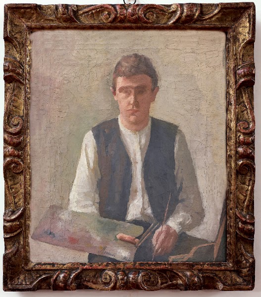
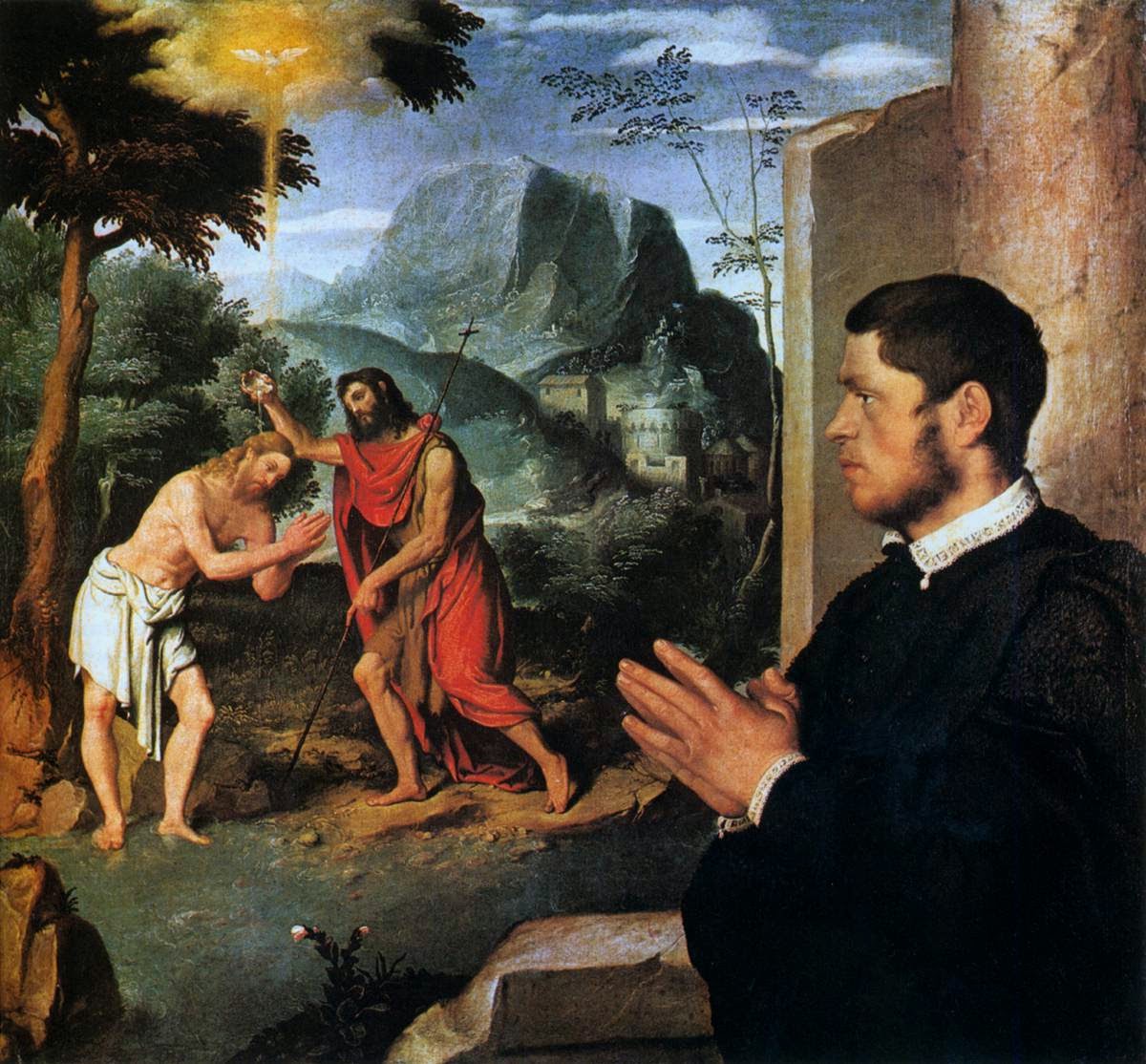
"Villaggi" is a still life show but I wanted to include two works that function a bit like backstage footage and interrupt the quasi obsessiveness of the theme: so I purposedly painted a self portrait while arranging a still life ( also a connection with my other work ) and a study of a landscape by Bellini.

Where and when
I have an ongoing relationship with Elle Arte, a well established gallery in Palermo with a high professional standard. Laura, the owner, shows my work regularly so she was the first one I called when I made the decision to have a solo show. This also meant getting in touch with other galleries I work with to let them know they wouldn't get much work from me in the following months and also deleting "call for entries" to art competitions from my inbox so that I could build up the work faster.
I originally set a date for 2015 but as a closer slot became available I accepted to speed things up. I think October and November are the best time to show in a city as well as spring months. 
If you are planning a show somewhere don't forget to check out the town's calendar. In London, for example, opening on Halloween night during the school holidays wouldn't be a great idea, while I was told that in Palermo this is a time of the year when families get together and stay in town.
In Rome a few years ago I was showing during the local film festival so it was impossible to have a press release published because local arts pages were all clogged with reviews. Research in advance !


Photographing and framing
In the meantime, work goes on in the studio. As I finish paintings, I photograph them and file the images. ( also have a list of paintings with measures on a piece of paper, you'd need the info a countless number of times, it's quicker !)
I normally take photos outside on an overcast day and adjust images in Photoshop. If I were to sell giclee prints I'd definitely have them done professionally, but for postcards, online posts and a small catalog I'm perfectly happy with my own pics.

   Normally I order natural wood frames online and paint them myself. I have approached the framer and obtained a small discount seen the number of frames I order from them. 
I must say that I probably don't save much money by doing the work on my own but I enjoy it very much. Most of my frames are gray and/or white: it's good to find one or two colours that suite all the paintings so the show has a unified and tidy appearance.
I prime the natural wood and paint two or three coats of matte emulsion, some times adding a little depth by painting coats of different tones and sanding exposing the colour underneath.
I finish off by sanding with fine steel wool and polishing with wax.
I use z-shape clips to fit the canvas in the frame and attach gummed tape to the back.

I fit a string behind the work for hanging, but for medium and small paintings I also include a single triangular fitting because the string can prove a real nightmare if the gallery has a chain system for hanging: it's impossible to align the paintings ! 

I like to have control of my frames however this time I decided to send my smaller works to be framed in Italy as I wanted a slightly different mould that the online supplier didn't have.
I recently visited a small bottega in Tuscany ( no website !) that does fantastic job at a better price and I also figured out it would cost me less to ship small works on panel from UK to Tuscany, frame them at Italian price with bulk discount and ship them on to Sicily. Check local services !


Packing and Shipping
If you have read until now you'll know I do my best to keep costs down. So I did not build crates, I don't know how to do it, don't have the space nor the tools, but
I'm happy to say that all my works arrived safely to Palermo.
For medium size works I purchased telescopic sturdy boxes that are intended for moving mirrors ( on Amazon), and I saved the large flat boxes in which my frames arrived. I used a lot of cling film and bubble wrap and probably ingested half a roll of brown tape ( not enough hands for scissors!).

I bought cardboard corners that I fit onto every painting protecting the frame with cling film. I then sandwiched bubble wrap between paintings in similar sizes and tied them together very firmly with wide packing cling film so that they couldn't slide, then more bubble wrap around the whole thing and in the box very clearly marking "Do not stack" and using "Fragile" tape.
I booked the shipping with an online shipping comparison website and chose a land service that turned out rather cheap. For a show a couple of years ago the gallerist had secured a sponsorship for the shipping by including their logo in the catalogue, worth a try.

Advertising
Most of the job locally is done by the gallery, including securing press coverage  by sending a press release to local newspaper. Here in Palermo hard copy works: the gallery invested in postcard invitations to send their clientele and leave in book shops, cafes etc.
Social networking is useful to remind people about the event and to send more extensive information about the show. 
I sent a newsletter ( using Mailchimp) to all my italian contacts even if they live elsewhere. You never know, people have spread the word and I'm expecting some extra guests who are friends of friends. 

Catalogue 
A catalogue is an important record: nowadays there's no need to invest a large sum to have enough copies for everyone. An online Print on Demand service allows you to only print a few copies that can be given to the best collectors and to potential or actual galleries.
I asked an artist friend, James Bland, who is both very articulate and familiar with my work, to write a piece that I have then translated in Italian.
Again, I did a little homework to keep costs down. I originally composed the whole catalogue with a software from Blurb but I also asked for a quote to a local printer in Sicily that came out much cheaper. I uploaded my draft on the Blurb website and bought a digital copy. 
I then showed it to the Sicilian printer to show him how I wanted it ( too complicated to compose again with a new software ). I then optimised all the image files for printing, converting them to CMYK and uploaded them on Dropbox, and he put the catalogue together. Again check the locals !
I also uploaded all the images and the text on a Tumblr blog: I chose Tumblr because the images appear very large. 
I included a link on my newsletter for people to see the whole catalogue online. 

Opening
I have spoken with my (poor!) husband at length about the work, "rehearsing" a bit of narrative about the paintings. It's important to memorise something coincise, coherent and interesting to say: you don't want to be caught by surprise and stutter something silly to a good  collector ( yes that happened to me).

At this point I can say I did my best and I only want to enjoy my time in Palermo.
The plane is landing... I can't wait until tomorrow ! 


Martin Yeoman's Open Studio and Studio Sale -This Weekend

$
0
0
I became aware of Martin Yeoman's work in 2009 when I saw this small drawing at the Royal Society of Portrait Painters show.


Since then I went to see one of his shows in 2010 in the now defunct Petley's Gallery in Cork Street and, this year, signed up for one of his classes at the Royal Drawing School. ( see a video interview with him here, then part 2 and 3)


      Martin is approachable and generous with his advice and in a single week under his tutorship I learnt a lot. He is the sort of tutor who teaches by example, sketching small heads on a piece of paper to point out drawing inaccuracies and taking knife and brush to  students paintings to simplify and demonstrate his free and loose brushstroke. He will be teaching again at the Royal Drawing School for a week from the 12th of January ( his class fills fast, book early !),


His website is a frequent destination for me when I am in need of inspiration and counteracting some of my painting bad habits.
One of my favourite bodies of work that he has produced is this series of paintings and drawings of Pole Dancers. He painted these from sketches made in Soho strip clubs, as a last row visitor who sees the scene through the filter of the old masters. There's the nude, the overtly sexy nude under cheesy coloured lights, and there's the indistinct mob watching, trying to touch and who knows what else they are up to. Lautrec and Degas come to mind for these paintings that talk about women, men, power, loneliness.


Woman with Raised Arms, reworked 2006 to 2009
oil on canvas
30 x 36 inches
Martin is also a brilliant portrait painter. His work is intimate and affectionate; it comes across as a process in which there's a strong emotional participation. He asked this lady to sit for him after spotting her resemblance with one of Rembrandt's portrait ( on show now at the Late Works show at the National Gallery). The delicacy of this piece is remarkable and one of the most moving painting of old age I have seen in recent years.


Margaret
24 x 20 inches

Martin will be holding a Studio Sale and an Open Studio day this weekend. I think that it would be a wonderful opportunity to meet him and get hold of one of his works.


Last but not least a familiar ginger head I found browsing the portrait gallery: do you recognise this intense and focused child ( hint: sing...) ? 


Mi Blog Es Tu Blog - Susan Wilson

$
0
0
I have known Susan for more than ten years, I have been taught by her and we had children in the same schools. Born in New Zealand, she arrived in London in 1976 and her work has been widely shown in UK and NZ.  She has a straight forward attitude towards painting that I always admired ( read about her studio gear in this post); what for other painters might be a source of inspiration, in Susan's works gets chewed and swallowed up whole: literature, old masters, foreign landscapes, costumed portraits. Her insatable painterly appetite results in pictures that are always engaging, challenging, confrontational.
Here is an interview from 2008 with Michael Peppiatt.

Susan is having a solo exhinbition at Browse and Darby next week, and chose this painting from the show:

Tiepolo Sky with Hollyhocks    
oil on linen, 30 x 50 inches


I have been driving across Europe this year to deliver paintings and prints- and then collect them- to an exhibition at the Bibioteca at Cassino where my father was a stretcher bearer with the NZ Medical Corps at the terrible battle for Montecassino in WW2.

I planned the route around Tiepolo, so we had a stay at Wurztburg to see the Tiepolo ceilings in the Residence there- reader- see them, you will never be quite the same-, then Udine, where again the NZ Medical corps was stationed at the close of the war, and young Tiepolo painted the Archbishops Palace, hollyhocks stand by the door Sarah peers around as a handsome angel arrives to tell her she will have a child, then Villa Valmarana ai Nani, where Giandomenico and Gianbattista again worked together as at Wurtzburg. Lorenzo, another son, also went to Wurtzburg.  They lived in a room at the Residence for two years and I keep imagining them lurching across Europe up mountain passes from Venice in a  horse draw coach.

So the Tiepolo sky picture is a distillation of thinking about Tiepolo after Mary Kuper (illustrator) gave me "Tiepolo Pink" by Roberto Calasso ( he's one of the foremost Italian intellectuals !) to read . It was made in my garden - I grew the hollyhocks and was given them as small plants as well, by Oonagh Elliott.
I sat outside, used a big linen canvas, and watched the clouds go by. My dog walking affects how I paint skies, as I am out with her twice a day in all weather. She is an orange pointer bitch, and she features in Goya, and Tiepolo, same dog!

The picture is on show at Browse & Darby from 9th Dec.

Paint? Sax naples yellow, alizarin crimson, sax heilige blau, titanium white, linseed, rickety old chairs to support the picture and thats it.


WEBSITE:
http://www.susanwilsonartist.com

Painting and Back Health

$
0
0


Pontormo


In recent weeks a fortunately short bout of back pain has made me think about the best practices for an easel artist to keep a healthy back.
In my experience the "move" from the table to the easel when I started working in oils years ago represented the end of all neck pains I have been suffered since school days. My posture has always been quite correct despite being tall but I always had the tendency to hang down the head when sitting at a desk. This of course meant a constant strain for the trapeze muscle that resulted in sore shoulders and a stiff neck.


     When I started working at the easel and, like a homo sapiens, finally looked ahead rather than down, all of this disappeared. In my early days as an oil painter I used to stand all the time, both in class and very often in the studio. I sawed off the top part of my easel so that I could lift the base up and work standing even with small paintings.


    For a few years I also had one of those Swedish chairs with the seat at an angle and a knee rest. I realised though that I often ended up perched on top of it slumped forward with my feet on the knee rest. An ostheopath recently explained that even if used correctly those chairs are no good, as you end up having all the weight supported on your knees, which ultimately damages the joint and might affect the sciatic nerve.

   In recent years, as I concentrated on table top still-life in which my point of view is aligned with the set up, I work sitting 90% of the time. A good amount of time spent working on printmaking also meant again sitting at a table and working on small scale works that need to be looked at from a close distance. Since I am not getting any younger I decided to find out about the best way of preserving a healthy back. I asked my GP's osteopath and posted on FB to get advice from fellow painters.
You probably already know all of this but here's a little reminder anyway:


- Take breaks
 Cindy Procious points a timer if she becomes too absorbed in what you are doing and take a short break to move around. I want to think that a certain space and body awareness develops naturally with painting skills, so it's good to relax the muscles involved in handling the brush. Judi Green uses Spikey Balls to massage the back during breaks, while Linda Brandon does push ups ( I'm impressed!)
Ingres at the Phillips Collection, Washington


- Exercise
 Donald Beal has obtained a set of exercises from a physiotherapist to strengthen rhomboid muscles ( between shoulder blades) and hold a good shoulder posture. In case of pain there are contrasting opinion if osteopathy or physiotherapy is the best option ( see difference here). Annie Brash Kelvin opted for a personal trainer and Lylian Peternolli for jogging.
I must confess that when it's time to go to the gym I always find something more interesting to do in the studio. I try to go twice a week and I don't do classes because I know I don't like to go at a regular time. The osteopath advised me to do "a bit of everything". Best of best, he said, is swimming front crawl, otherwise do a little on all aerobic machines: treadmill, bicycle, cross trainer, rowing machine and the like (no Power Plate) followed by core exercises with control.
Pam Hawkes  says: one of the postures I have developed over the years is to try, when standing or sitting, to fold my arms behind my back and hold the opposite elbow with each hand; it helps keep those long back muscles stretched.
This is a good exercise to relieve tension in the jaw, as we often clench it without realising. Place a fist under your chin as when you support your head. Open your mouth slightly pushing hard against your hand and count to seven, relax counting to three and repeat a few times.
Pilates, yoga etc. are all good disciplines of course, and Sophie Ploeg suggests that I get another dog ! ( sigh)


- Palette
Dennis Spicer bought a cheap tea trolley at a charity shop  for his palette, while Linda Brandon clamps it to another easel close by. David John Kassan has developped a vertical palette that also has advantages for comparing your mixes as it's positioned beside the painting.
I haven't tried DJK's palette but having worked on a glass palette on a trolley in the past I now feel I am doing well with holding a wooden one. I have a couple of these large palette, one that is slightly smaller and fits in my painting backpack and a larger one for the studio. I got them from Green and Stone and they are light and balanced and don't strain the arm or the wrist at all. ( I know, Roy Connelly, I should put it down but I like it !).


Posture:.
Maryanne Buschini ( and my osteopath) suggests a Swiss ball chair. Gallerist Jonathan Ross suggests the Alexander Technique but I must thank Gail Sauter who suggested a book by Esther Gokhale ( similar to Alexander Technique in some aspects). I only had it for a week or so but I found that
the explanations are very clear and the posture she suggests feels very natural to me. I learnt not only a new posture for sitting but also one for when I stand and look down such as when making monotypes or framing. I tried this today and it felt very good.

If everything else fails, I leave the last words to the wise John Hansen:  "A cure that works almost as well as exercise is age. Time and ageing pain receptors help. I use both."


So, why would men be more interesting to paint than women ?

$
0
0
    

    A few weeks ago I read this article on the Daily Telegraph and I just needed to post my views.
Tai-Shan Schierenberg is one of the most important British portrait painters of these days: he has painted very distinguished sitters including the Queen, Lord Sainsbury, Seamus Heane. He won the John Player Portrait Award in 1989 ( now BP Portrait Award), his work is on permanent display at the National Portrait Gallery. He is also the principal of The Art Academy and an honorary member of the Royal Society of Portrait Painters. In the past two years he's been a judge of the reality show "Sky Portrait of the Year" ( I didn't watch it, does he prefers male portraits in the show ?).


     His latest show, New Works, opened on the 12th of November at Flowers Gallery; I saw it this week and it is an excellent exhibition. Presumably at the press preview for the show, Schierenberg chatted with this Daily Telegraph journalist  who managed to focus his piece on commissioned portraiture - which is not included in the exhibition by the way - and came up with a catchy title that it's not really explained.

     I don't know if or to what extent Schierenberg's words have been misrepresented but the result is a veritable own goal on the part of a very good artist who, aside from blatant sexism, misses an opportunity to talk about what modern portraiture should be.


In the newspaper piece Schierenberg launches himself in a rant against his own sitters. Vanity seems to be one of his main preoccupation when he is at the easel. 

"Men don’t like being shown in any way vulnerable.... They’re worried that I might see something they don’t want me to see, which can cause a bit of a power struggle. Men are often very proud of their scars and their frowns, and they don’t mind showing that stuff, whereas if you show that in a woman’s portrait she’d be very upset."
In a string of common places he says that in his experience men are concerned about their status while women crack under the pressure of being beautiful and youthful. When confronted with their own painted image his sitters are reduced to their Mars/Venus hormonal self, as testosteron inflames men and progesteron reduces women to tears. He concludes by saying that there's something wrong with women because they are not impressed with his struggle and that he cathegorizes them into "attractive and unattractive". 


        I wouldn't object to a painter who states that he is more interested in portraying men because he/she personally prefers to paint harsher and more defined features but these comments on gender attitude strike me as shallow and untrue. 

Perhaps my experience is not comparable to the two decades of high profile career of Mr Schierenberg, but I haven't really encountered these stereotypes. I have encountered a pinch of vanity, yes - don't most of us have that?- and actually I have found that men are concerned about their looks as much or even more than women, but this is nothing compared to the pleasure of getting to know someone and work together. Yes often painting a portrait is a power struggle between artist and sitter - or a sitter's parent- but it is also an engaging collaboration where their input and their commitment is essential.  
I think that it is the duty of a portrait painter to open a channel of communication with the person they are painting, and it's when that happens that the whole process becomes fascinating.
I like listening to their stories or witnessing their thoughts passing through their face. Looking at the latest portrait by Schierenberg, the one he painted of his father on display at the exhibition, charged with emotion, I really can't understand what would prevent him looking for the same humanness in a female sitter. 


 Dear Prominent Ladies, Woman's Hour Power List Game-Changers and the likes,
now that you know if you want to commission a portrait please remember that I am very interested in painting you, at a fraction of the price.


"National Gallery" FIlm

$
0
0


    Having read some good reviews, last Sunday I went to watch this documentary by filmmaker Frederick Wiseman. At short notice I couldn't find anyone willing to endure three hours so I merrily went on my own and, particularly since I didn't not have to worry about the amount of boredom inflicted to spouse, I really enjoyed it.
The film is somewhere in between a fly-on-the-wall documentary and a photo of a museum by Candida Hofer. Images of paintings and visitors in museum rooms alternate with recordings of gallery talks, board meetings and discussions on conservation.

    There is no commentary, no narration, but the film is so self explanatory that there's really no need for it. The images, which I think have been recorded over a number of weeks, suggested to me the flow of a day.
The film opens with the whirring sound of a floor polishing machine and a glimpse of the gallery preparing for the daily opening, proceeds to "spy" on a morning meeting where we see the NG Director Nicholas Penny dealing with marketing issues. As the "day" goes on and we are shown people looking at masterpieces and a few ( too many?) gallery talks to the general public and to children.
It is quite revelatory how images of people queueing in the cold for tickets to the blockbuster Leonardo show precede footing from  corporate events evenings, and how the talks become more sophisticated when they address a public of "connoisseurs". Wiseman says his films are "based on un-staged, un-manipulated actions... The editing is highly manipulative and the shooting is highly manipulative... What you choose to shoot, the way you shoot it, the way you edit it and the way you structure it... all of those things... represent subjective choices that you have to make."

   Visits to the "backstage" are very interesting. The team from the conservation studio gives us a taste of the technological department of the Gallery's life, even if they too have to oblige to corporate visitors. The manual ability of the craftsmen painstakingly carving and gilding frames in the silence of some lab is hypnotic, and the care taken with the lighting of a display draws our attention to aspects that we might overlook.

   In a couple of shots we see people sketching in front of paintings, and two scenes present the art classes that take place in a frankly quite unsuitable room with a bad lighting and a circle of desks; it's the only time when the film touches on the subject of making paintings and on the museum's role to inspire and engage with artists.

    I have never joined one of the group talks from the NG program but having sat through a few during the film I am disappointed at how they (or the editing) focus on the subject and the iconography of the painting; from there we jump directly at the spectrographic analysis of layers by restorers. What happens between the moment the artist chooses the subject and visualises the scene and when we are confronted with the resulting physical object, the act of painting, is not looked at.
   Rubens'"Samson and Delilah" is explained as if the artist was a film director or a cinematographer, his main task placing and lighting the figures. Nothing is said about the impossible activity of taking some dust, mix it with oil and applying it to a piece of fabric and make something that is so individual and sublime that nobody can replicate it.


    We are told about Titian's paintings and his love for Ovid; we are even read a poem about the nymph Callisto but what about the surface of Titian's paintings, what about his revolutionary contribution to painting ? What about the way in which his teacher's glazing process is forgotten and the sensuousness of his nymphs is found precisely in the sensuousness of his paint, where the matter becomes flesh ?
Speakers in the film seem to be all art historians and the only one who introduces herself as an artist states she is not a painter but makes installations !

 "National Gallery" is enjoyable both for people who visit regularly and for those who don't have this privilege, its slow pace leaves the viewer time to think and flavour the atmosphere of the museum.
The attention to the visitors reactions, the slow track-shots in the empty rooms and the enlargements of painted details had made me hope for more, for a film that was enamoured with the deep and mysterious ways in which masterpieces affects us, but this is a long and at times beautiful documentary about the institution and not art itself.


Olha Pryymak - Ukraine Diaries

$
0
0
     In this cold and gray Sunday I crossed London to go see Ukraine Diaries, an exhibition of paintings by Olha Pryymak at Krilova Stelfox Gallery just off Brick Lane.


I was very touched by Olha's work; eight groups of small square paintings record days in which events in her native Ukraine cast their shadow on her quiet family life in London.
As an expat I fully understand the deep link with the native country, a link that is particularly strong nowadays when information travels fast, when there is always a camera around to record images and sounds, when strangers can give you an account of facts as they are happening.

Olha selects instants of some particular days: when her brother graduated, when the protests started, when the plane crashed, when her son walked the dog. 


He practices on the clarinet, maybe she is looking at news on the phone while she listens. He plays innocently with his toy soldiers while elsewhere troops are killing dozens of people in the snow. Where are we, here or there ?


The paintings are installed in asymmetrical clusters, some times they are coupled up, one in direct response to the other one. The show is hanged in chronological order of days and surprisingly proceeds  counterclockwise. In the Eastern Orthodox tradition we do everything the opposite way, says Olha.
All the paintings are on small wood boxes, their square format recalls images on a screen, they are images of images, all equal: interiors, landscapes, portraits, London, Kiev, the phone screen, a newspaper. They all contribute to convey the bewilderment and horror at a protest that unexpectedly turned into riots, then violence and ultimately a full fledged war.

The paint flows fast because recording fleeting visions, flickering videos, a casual appearance of the Ukrainian flag colours in an urban decor, is urgent. They need to be fixed before they drift away again  in the flux. Synapsis are firing, connections are made, some obvious, some only known to the artist.


We can almost hear the droning of the news, the clarinet being played, the pinging of new tweets, the sound of a shooting. Politicians are staring at us in gray ink from the front page, they don't do anyting while explosions obscure the painted space.

Olha Pryymak's Ukraine Diaries is at Krilova Stelfox Gallery, 23 Heinage St, London E1 until the 25th of February.


AAF in Milan

$
0
0
    Last week I had an interesting experience as I accompanied my London gallerist, Kathryn Bell from Fine Art Consultancy, to Milan for the Affordable Art Fair. Kathryn is a veteran of AAF but it was her first time in Milan and she thought she might do with someone who spoke the language.
Aside from the late arrival of the paintings, for which we had only about three hours to set up the whole stand, everything went well and we had good sales and a lot of compliments for the work we displayed.

I was lucky enough to sell this painting, a "behind the scenes" image from my studio, painted at night under artificial light. It was enjoyable to talk to visitors and a little difficult to fend off the artists who thought it fit to come submitting their work at the busiest time of the day.

Chaotic Still Life, oil on linen, 46x72 cm

   What struck me the most in the fair was the lack of perceptual paintings. Actually I think my work might have been one of the few that implied looking at reality among the about ninety exhibiting galleries.  The quality of the paintings and sculptures on show was at times frankly embarrassing and I wonder if many galleries underestimated visitors and tried to shift the worst of what they had under the pretence that is cheap. This in turn discourages many good artists who might be in fact happy to sell their work for under 6000€ but don't take part because of the lack of quality.
My gallery preferred to show good works of established and popular artists even if this meant getting very close to the upper price limit, and the decision paid off. 

   Anyway someone looking for "realist", for lack of a better word, painting would have been very disappointed, and it was frustrating to see what people carried out ( the spirit of the fair is that you walk away with the artwork you have bought). As the days went by I realised that the most popular works were what I call "joke" works, paintings that play on humour such as large cityscapes with an ostrich running around, little compositions playing on the name of famous artists ( Duchamp Shampoo, Klimt Eastwood...seriously) or large head of celebrities traced and painted on newspaper collage.

   Were these buyers the same people who queue up for the umpteenth Caravaggio show, who travel around Italy for arty gourmet trips, educated professionals who are keen for their children to appreciate art and play music, and hail from the cradle of visual art civilisation? I was baffled.

    A remark by James Bland shed some light on this and made me think: irony is a way of distancing yourself from something. If I say I like a certain painting, then my taste can be scrutinised and I can be judged upon it. If I buy art without really engaging but I declare it amuses me I am safe and can retain my cool. If I make art and then give it an ironic, sarcastic title then it doesn't matter if the piece is any good, I was only joking.
A walk around the high brow world of contemporary art at Frieze fair is not too different from the AAF, just a little more expensive and sophisticated: many playful or satiric artworks that have no intrinsic value and do not require a real commitment, just a financial investment.

  Irony is not a 20th century element in art. I always thought that we perhaps disregard it but that all of Zeus naughty affairs were conceived with and for amusement, that nymphs and satyrs having fun in the woods were not viewed seriously, however they were painted seriously. Once the humour has worn off, what will collectors of modern farcical pieces be left with ?

As for me, I declare shamelessly that I take full responsibility for the paintings I make ( now travelling to Hong Kong for the upcoming AAF).

G.K. oil on panel 24x18 cm


Landscape

$
0
0


        In these past weeks I had to travel often and I wasn't able to spend much time in the studio. Perhaps my concentration is not very good but I find it hard to start any serious work when I know I won't have a couple of uninterrupted weeks ahead.  Since I was spending a few days in the countryside in Italy over Easter I thought I'd try at least to cut myself off for some time and sit in the garden to paint. 


All images are iPhone photos of small paintings on paper 23x31cm
   I was confronted with similar problems as when I was in Civita Castellana for a residency two years ago.  Painting the landscape is intriguing but alien for me. I was always drawn to portrait and still life, to interiors, and my favourite artists are not pure landscapists, however a trait of my character is curiosity, sustained by a certain tenacity; I basically just want to understand things on my own by trial and error.
  It is well known in my family - and I'm quite proud of it- that I never had any talent whatsoever for drawing, but I liked it so much that I just had to learn on sheer will. And now I feel the same tingling for landscape: I view it as something I must have a go at if I want to deepen my comprehension of painting.


    The first hurdle I had to face when I was in Civita was that my palette was completely insufficient to paint that luscious area. Maybe I could have managed a desert with all my tubes of thick earths but certainly not the intensity of a blue sky or the saturation of green leaves. I should have had cadmiums of course and some titanium. That thing that any palette might do is not true. In these past days I corrected that and added cobalt turquoise, cad. lemon and sap green while barely touching ochre. Maybe too much but eventually I'll get there. 


    Some notes to self after Civita's meltdown: in an Italian summer outdoor shadows are cool. Full stop. Not warm as I have painted them indoors for the past ten years. 
 Wear a hat. 
 Learn to open and close your easel because you are a total nerd and it is in fact possible to do it with two hands only. 
 When you stand in the sun colours will look more saturated and if you don't keep it in mind when you take the painting inside you'll have a bad surprise. 
 If you worry too much about colour you forget all the tonal relationships and all will be lost. 
 Find a strategy: sky first ? But then it's wet and how does one paint dry branches on top ? Sky first then branches then keep more sky mixture on the side to paint in between branches ? 
 As mother-in-law says, there's nothing more definitive than what you thought was temporary. Mix colour accurately because most times there's no going back. 
 Change description to "Mixed Media: oil and insects on canvas".


    So here are some small paintings from the past days. One thing is immediately clear to me: if I venture ourside it has to be home. Tuscany ( Chianti, Maremma), maybe Rome. 
It makes no sense at all for me to travel somewhere and record my experience there and although I love living in London I don't have that gut connection that might compel me to go down by the river and set up there.  I worked on paper ( which I never do) in order to feel no pressure at all about "producing" anything and so that I could snap myself out of any habit.  


This surface doesn't help but I thought that I shouldn't give myself any unfair advantage since the aim was just to find further, bigger problems. What to paint ? Why ? Is it about space, or light ? What part plays form then ? What is my landscape painting about ? What is the pictorial space like in my work, shallow, deep, intimate, wide ?


I'll be back in London tomorrow, which means there will be no more field work until the summer at least, but I can now have a go at turning these sketches into larger studio paintings and see if there's anything there. It will be a very long process.


Tested for you: Periscope (iOS app)

$
0
0
   On this rather idle Bank Holiday weekend I have been introduced to a new app that is quickly becoming popular. The app is called Periscope and it is own by Twitter; at the moment it only works on iPhones and iPads and you have to have a Twitter account to be able to use it.

What you can do with it is broadcast videos directly from your device, you can do that publicly or to a selected audience of people who follow you, imagine skype meets social networking.
Video and audio are of good quality and as you record you can see how many users are watching you and who they are. You can share your video through Twitter and, if you wait a little after you've finished recording, the video will upload to the app and your followers you will be able to watch it for the following 24 hours.

As a viewer you can sign up for notifications that will alert you when one of your contacts is broadcasting and while you view them live you can send a text. Broadcasters can read your messages on their screen and answer you on video. You can tap the screen for "like"s, they appear as little floaty coloured heats ( meh).

I have been browsing the app in these past days and I must say that it's full of people just sitting on a sofa and asking viewers for questions. Silly stuff. Very silly. And of course the app is bound to be misused, after all there's a good percentage of porn in the web, but one can easily stay clear of that.  I have watched reporters walking around the Expo in Milan, a potter being interviewed, images from a concert etc., interesting stuff. 


Current state of affairs of self portrait, still on the easel

I think this could be a great tool for artists. I have tried to broadcast myself painting a self portrait yesterday and this morning, and it went quite well aside from the noisy building works nextdoor.

I set up my phone with one of those little bendy tripod on an easel between me and the canvas so it showed a close up of the surface. On the first broadcast I specified I could not take questions at the start but then later on I did look at the screen and had a few exchanges, though it was a bit distracting.

Set up for recording


Demos, reports from exhibition, studio visits, question sessions... there's a lot that could be done. I think an android version is in the pipeline in the meantime my nickname on Periscope is "ilayuk", I hope to see you there !


Introducing Print Solo

$
0
0


Dear Friends and Readers,


  I am finally ready to talk about a new project on which I have been working for the last few months.
The idea came to me as I was looking for a platform to sell my prints online. I felt that large online art-sales websites were not right for me and also that they carelessly bundled up original prints and reproductions.  There is a big difference between them: reproductions, limited editions and giclee prints are basically signed photocopies of an existing artwork such as a painting or a drawing, while to make an original print the artist has to work directly on a matrix made of metal, wood, stone, linoleum etc.

  I wished there could be a website that focussed on the fine art of printmaking and that was reserved to established artists. And so I decided to take the plunge and make it !

 Print Solo is a website for all of those who concentrate their practice on printmaking, for those who, like me, have lately discovered the printing press and use it as a secondary medium, and for those who like to buy art and are keen to support artists, and for those who are open to appreciate and learn something about artworks that they had perhaps overlooked. Oh yes, and for those with a difficult-to-match sofa colour. I think this covers pretty much everyone.

     Printmaking is not just about being able to reproduce an artwork more than once but it is a fully independent medium that allows artists to do things that are impossible in other mediums: take the incredibly fine lines of an etching, or the softness of mark of a lithograph, the grain of a woodcut. Artists like Durer, Rembrandt, Morandi and Matisse have enhanced the quality of printmaking and took it to a sublime level. There is so much exceptional contemporary printmaking that is not often seen in galleries and deserves a space of its own where it can be shown and explained to the general public.


   On Print Solo printmakers will sell prints and artists' books independently; collectors will have a
chance to make contact with artists, see and buy prints from all over the world. There will be a blog with articles and interviews and a wiki section to learn more about printmaking techniques.

   It's not easy to become a startupper when you are a 47 years old artist but I have found a small team who's helping me doing things exactly as I had envisioned them. I hope that from these lines you can infer the passion and enthusiasm I have for the project and that you will support me in this adventure.
There is a group of prestigious printmakers who have lent images of their prints to illustrate the website. They set the bar so high that I now wonder if I'll be good enough to sell on my own website !
My ambition for Print Solo is that it might become a hub for the best in international printmaking and most importantly a direct line of support for artists. I'm also particularly keen to develop the artists' books department: they are beautiful works of art, delightfully tactile.
The whole project shares the same ethos as this blog: promoting knowledge, art and artists.


In the spirit of  hand-made,  the texture for the logo has been devised and made by yours truly.


 Print Solo is online now with a  page designed to compile a mailing list and to receive feedback from artists, collectors and art lovers. It is important that you visit, click through and let me know what you think by answering to the short questionnaire and leaving your email. I am planning to have a fully functional website built in the next months so that it can be launched after the summer.

Print Solo also has a Facebook page and a Twitter account to keep in touch with its community.


Summertime

$
0
0
Summer is always a long pause away from the studio as I spend some weeks in Italy and Spain so here's a brief recap of what happened in the past months and what's next while I enjoy a lot of family time.

START UP
If you follow this blog you should know about my new adventure, Print Solo
I hope that you have already visited the website, and that you will check it out again upon reading that starting from last week we have a great new addition: Print Solo Summer Gallery, a page with some prints for sale !

 All the prints in the gallery are an online exclusive: not only they are not for sale anywhere else on the internet, but some of the artists don't even have them on their website yet. And the good news is that they are very affordable and made by international printmakers who, on top of their artistic sensibility,  have great craftmanship and impressive CVs.


Golden Walk, a monoprint by Alicia Rothman on Print Solo Summer Gallery

Last week I have been interviewed by Lisa Takahashi (I really like her Cyclists prints) on the Jackson's Art Talk blog about Print Solo and my own work.

PAINTING
Of course the work on Print Solo has been at the expense of painting hours, but I feel like a strong push is needed right now and if the project works I will then be able to work more in the studio next year. Besides, creativity can be expressed in many ways.  I also had to travel a little more often during the winter so I worked when I had time without looking too much ahead. The resulting works are some still life that are about disorder and sedimentation in the studio.

Sopra 51x67 cm


Sotto 51x67 cm
I showed this one at Heatherley's School of Fine Art in an exhibition on Still Life and it will soon be shipped to a new collecctor in the Far East. 


Babel 102x76 cm

The next show will be the 20/21 British Art Fair at Royal College of Art in September. 


PORTRAITS
In May I had a painting selected for the Royal Society of Portrait Painting which is always a great show to be in. I recently completed a couple of commissions that I enjoyed very much, working from life with two beautiful girls and their musical instruments.


PRINTMAKING
Not too much to report: I had a monotype almost selected ( the exact definition is shortlisted but not hanged) for the Royal Academy, best luck next year I hope. In June I paid a visit to my friend Maureen Nathan who is so brilliant with linocuts that it made want to have a go, it's addictive !


Head of Woman, linocut, 10x5 cm
Satyr III, monotype, 20x15 cm


TEACHING 
I have quit teaching regularly in Lots Road but I have been doing some substitutions standing in for Alex Fowler and James Bland. I also have been asked to take on a Weekend Masterclass at The Art Academy in autumn and I am looking forward to it. Details will appear soon on the Art Academy website , but dates are confirmed and it will be on the 10th and 11th of October.

 Have a good summer everyone !


Viewing all 85 articles
Browse latest View live