Quantcast
Channel: Ilaria Rosselli Del Turco - News
Viewing all 85 articles
Browse latest View live

Mi Blog Es Tu Blog - Tim Benson

$
0
0
I met Tim several years ago as he was a substitute in a painting a class at Heatherley's. Since then we found ourselves together in a few prize shows such as Ruth Borchard Self Portrait Competition, RSPP etc.. We are showing together again next week at Milton Gallery in London in the Portrait Painters Today show. 
He contributes to the series with this bold and expressive work.


92 Years, oil on canvas, 48'x 48'


 WHO ARE YOU ?
My name is Tim Benson, I am a 35 year old oil painter specialising in portrait work. I work from my studio in North London as well as in situ when I paint landscapes. I am a member of the Royal Institute of Oil Painters and was elected their Vice-President last year. I teach portrait painting at Heatherley's School of Art in Chelsea and at the Art Academy in Southwark as well as tutoring private clients.

WHY THIS ONE ?
This piece is very close to my heart as it is a portrait of my (now) late grandmother who was suffering with dementia at the end of her life, the painting is a homage to her.  It's called '92 Years', oil on canvas, 48" x 48". The piece is not meant to explicitly be a study of dementia, but I do hope that it resonates with people who know somebody who has suffered with it.
WHERE IS IT NOW ?
It is now back in my studio having been exhibited at the National Portrait Gallery in 2012 as part of the BP Portrait Award.
TECHNICAL NOTES
My palette was the same for this piece as it is for all of my other paintings: titanium white, lemon yellow, french ultramarine blue, raw umber, cadmium red. I have since added alizarin crimson to my arsenal. I find that I am able to mix most colours from these core paints. I also tend to use only one large brush for any painting, the simplicity of my tools helps me to maintain a clear vision for the work as it evolves; I don't want to be sidetracked by too many brushes or paints.
MY WEBSITE
www.timbenson.co.uk

Portrait Painters Today / My Paintings

$
0
0
   As you might have already read I am in a group show opening in two days time at Milton Gallery in St. Paul's School,  London. It is a very good line up of painters and I am thrilled that I have been invited to show along them.

   In order to choose the portraits for the exhibition I looked back at my recent production and I realized more and more how my artistic vision is linked, some times consciously, some other not, with Renaissance tradition, and that my paintings are really about not being in Italy.
As an expat I have the privilege of clinging to an idea of Italy that is quite distant from a grim reality of chaos, carelessness and economic crisis. I made up my own Italy, a place that is almost suspended in time, where everything is enveloped in the elegant airy light of our old masters. I think that all I paint, in my mind, is there.


   These are the five paintings I am going to be showing:

"Geneva"
I thought I'd show this again because it's been really well received at the BP Portrait Award 2010.
It is only recently that I realised that of course there is Piero's Federico da Montefeltro portrait written all over it.


"Aude"
This is my most recent portrait, a commission. Piero's influence here is very conscious. His Maddalena in the Duomo of Arezzo for me should be the symbol of Italy.


Alberto
This is a small painting on board of my middle son. Although the cropping of the top of the head  is typical of photography, the reference here is those early Renaissance portraits of men glazing intensely at the viewer.


"A Girl from Virginia"


I lifted the theme of the girl with leaves from Giorgione's Portrait of Laura.


"Daniel Shadbolt, Painter"
  I was lucky that Daniel, whose facial hair comes and goes, was sporting a nice beard when he came to sit for me. I don't have a direct reference here nor I set out to paint anything particularly classical, but somehow I think that a certain classicism is still present.


Photos from the opening and show review in a few days time.


Portrait Painters Today - The Show

$
0
0


The opening this evening was a great success, the gallery was full and the show has been hanged really well.

Here are some iphone images of the evening:


With Tim Benson in front of his paintings.


Tim with Maureen Nathan.


Yep, that's him. Handsome !


Adebanje Alade checking out Jonathan Yeo's portrait installation.


Peter Monkman, winner of the 2009 BP Portrait Award in front of his haunting paintings. 


This row of portraits Adele Wagstaff  paintings was particularly beautiful.


Annabel Cullen, you might remember this beautiful portrait on display at the NPG.


Two poignant works by Michael Croker


Ian Rowlands couldn't be at the opening because he was teaching, here are his paintings.


I really regret that my phone doesn't do justice to the silvery light of these portraits by Melissa Scott Miller.

Thank you to all the people who came to the opening !  The show will be on for three weeks. If you are in London and want to see it just go to St. Paul's School ( Mon. to Fri. 9-6) and at the reception desk they will be happy to point you to the gallery.


Piero and Plato

$
0
0


    I thought about writing this post after stumbling on an article about the recent display of Piero della Francesca's paintings at the Met. I read the first paragraphs of this review on the NYT and something didn't sound quite right. This is the incriminated bit:

"Perspective is a way of constructing how the world appears to a single person. Its appearance in art coincided with the rising philosophical idea that all we can know about the world must come through the senses of our uniquely located bodies."

     This idea of knowledge could be perhaps applied to artists such as Leonardo, who through his closeness with the Dominicans can be ascribed to the Aristotelians, but is a big blunder when referred to Piero.
   I am recalling memories from my school days: Aristotele said that there were two ways of acquiring knowledge, through the intellect and through the senses, although the first one was the most important. Indeed Leonardo investigated reality and the laws that regulated it through his empirical studies.

   Piero's work stems from radically opposite premises. Bear in mind that in the powerful courts of the 15th century princes surrounded themselves with intellectuals and artists; the former ones dictated to the latter themes, iconographies, symbols.  For the first time the artist actually becomes an intellectual through his artistic practice.
   Piero is a perfect example of Renaissance artists. His life long friendship with Luca Pacioli, the mathematician whose work is still in use today ( he invented double-entry book keeping) testifies to his interests. Piero studies maths and geometry independently during his life and in his last years writes a treaty on perspective and one on calculus. He is aware of the new humanistic culture that flourishes all over Italy in those years, there is no doubt that current Neoplatonic ideas were embodied in his work.


   An important character at Piero's time was Cardinal Bessarion ( that some identify with the character on the left in the Flagellation trio), a very influential Greek intellectual who lived in Italy moving among the different courts, most notably in Urbino and Ferrara. Bessarion was a philosophy scholar who contributed to the diffusion of Platonism, which had a new breath of life during early Renaissance. In his writings he tried to reconcile Platonism with Christianity.

   The concepts expressed by Plato are fundamental to understand Piero: reality is a pale and imperfect version of archetypes, ideas, that exist in a different realm. What we perceive through our senses helps us remember those perfect forms, of which we are aware deep in our conscience but we have forgotten as we came into our worldly existence.
     Viewed through the lens of Platonism Piero's idealized forms acquire a deeper meaning. All of his paintings, although they contain striking realistic details, carry us in a metaphysical reality, where an almost unnatural light reveals perfection.


Sensing Spaces at the Royal Academy

$
0
0
Last week I was invited, through Katherine Tyrrell from Making a Mark blog, at the Bloggers preview of a new Exhibition now open at the Royal Academy in London ( isn't it great that this institution acknowledges the -mostly unpaid- work that bloggers do to divulge cultural events and the influence they came to have?).

The show is called Sensing Spaces- Architecture Reimagined and features installations by six architectural practices from all over the world with the general brief of working on the perception of space. The architects have each taken over a gallery of the academy and have worked independently to create different works.


Pezo


The Chileans Pezo von Ellrichshausen built a mastodontic terrace resting on four large columns each containing a spiral staircase. Kengo Kuma, from Japan, has assembled a light structure of scented twigs that he placed in two dark galleries. Diébédo Francis Kéré ( Burkina Faso) used plastic honeycomb sheets to create a tunnel like passage to which people can add plastic straw elements. 
Eduardo Souto de Moura and Álvaro Siza are two practices based in Portugal: the first one has worked inside making a replica of the RA marble portals with brutalist concrete, while the second one worked in the courtyard using the column as the basis for his reflection on space. The two final installations of the show are a wooden maze-like structure by the Chinese architect Li Xiaodong and finally two galleries have been taken on by the Irish duo from Grafton Architects who in my opinion have made the most radical and best manipulation of the space ( the work clearly references the Pantheon in Rome, so I am partial). Check out the videos that will tell you more on the architects here, the same 
videos are shown at the end of the exhibition.


Kuma


 My main question as I visited the show was: is this architecture or sculpture ? In a time when "archistars" buildings look like a sleek piece by Brancusi, is there a way to discern the two ?
The answer for me is to be found in the fact that the RA installations feature elements that belong to architecture: the door (Souto de Moura), the column ( Siza and Pezo von Ellrichshausen), the corridor (Kere and Xiaodong), the structural grid ( Kuma), the wall ( Grafton), hence I think that the artists all position themselves strongly in the realm of architecture. Each of them moulded the space with their installation: squeezed it through, made it look smaller, divided it, hid it in darkness, gave a rhythm to the light. 


Kéré

The show is "open ended", inconclusive: the architects put forward some spacial situation, it is then up to the visitor to explore and assess their perception. (BTW the RA is encouraging public to take original photos and post them with the hashtag #SensingSpaces, I think many people will engage into competitive photosharing and forget about the whole spacial awareness purpose of the show !) 


Grafton

Architecture here is not exactly being "reimagined" as per the subtitle of the exhibition, but still takes center stage not in its Aquatic Center/Shard form but in a more individual and life-related dimension. 
After the amazing blockbuster Bronze in 2012, it's good to see another non-painting show in the  RA Main Galleries and I think Sensing Spaces will be a success with the public and it is a good place for visual artists to go and reflect on this fundamental component of their work that is space.


Souto de Moura


[The show led me back to a thought I started reflecting upon this summer: how do painters manipulate the space? 
While I was in Civita for an art residency with JSS the painter Israel Hershberg made us notice how in Corot's paintings the same vast landscape in which we were staying looked intimate and small. 
In the same way that people in portraits by the same hand look a little like each other so the space we paint is similar from work to work. I think mine is, or rather I would like it to be: rationally organised in volumes mostly perpendicular to the eyes, relatively shallow and a lit by a warm pulviscular light. This past summer, as I tried landscape for the first time, the most difficult thing for me was to try and make sense of open space !]


Diarmuid Kelley Show at Offer Waterman

$
0
0
    Diarmuid Kelley is a painter with an excellent reputation who shows regularly at the prestigious Offer and Waterman Gallery in Chelsea, London. 
His latest show, All Cats Are Gray, ( buy catalogue) is on now and as usual features figures and still-life. 
I went to see the show and am sharing some iphone photos with details of the works ( all
other images come from O. W. website). I know that Kelley's studio is very close to my house but I never had the chance to meet him, not that he needs to go around submitting paintings to competitions: all his shows are sold out !  


                                                                                               There are a few interviews where he talks about his work online, but not many ( he defines himself as shy). One of the most notable points he has talked about for me is his strategy of stopping work on a painting as soon as he feels he is just "colouring in ": he often leaves areas of the painting untouched. I find this is most interesting when it happens in the figure rather than in the background, like in the hands of this work, Untitled ( Tessa) from 2007.


    Kelley's vision is inspired by Hamershoi, Vermeer, Caravaggio. Although, as he says, there is a "loaded stillness" in the paintings, I find they paradoxically have a cinematographic quality in the way atmosphere is created, as if the model was the still element and everything else was moving around him/her.
In order to achieve the dim directional light he depicts, he has built a little self contained room in his studio, a room within the room, with a window that allows him full control of the luminosity in the setting..


 As you can see from the glare in my photos, he plays with matte and glossy areas, working some times on white canvas, some others on raw linen, like in this 2013 still life, Untitled ( Beetroots).
Works on raw canvas have a more subdued light ( students please note!).


    Pencil lines are an integral part of the surface, often substituting paint and delineating a careful drawing. Paints are some times diluted to the point that they drip down, while in some other areas they have a much thicker body. Marks suggest a predominant use of square brushes, particularly when defining the form of a round object.


Straight lines result from a process of simplification of the form, to a point where they almost contradict anatomy ( see the jawline of Martina, from 2012).


This piece was my favourite in the show, so lyrical !


Don't forget to earmark his page !


Mi Blog Es Tu Blog - Felicia Forte

$
0
0
I have met Felicia last year at the opening of the Women Painting Women Show in Alexandria, Va.
She immediately struck me for her sophisticated stylish look and her intelligent eyes . The same sophistication and complexity is present in her paintings and particularly in this mysterious and unexplained image.


Black Dog, 70"x62" oil on canvas


Who are you?
That's a damn good question! I've almost stopped trying to figure that out, but you have inspired me to provide a more literal answer.
I am 34 years old and a painter and instructor of painting living in San Francisco. I grew up in Los Angeles. My life is filled with wonderful peers who are also my friends, and I am inspired and challenged every day.

Why this one?
This painting represents a breakthrough for me. It took me the better part of a year to accept, and then complete it. I had to redefine the term "finish" for myself.

Something about it.
The conception, execution and completion of this painting was, unbeknownst to me, paralleling the end of my marriage.
The conception: Last year a painter friend came to our school to give a workshop. One night over dinner she told me the story of her marriage twenty years ago. The images she described seemed stark and sad to me, but also beautiful and rich, (perhaps colored by my own lonely union). I told her that I wanted to paint that story, and about a week later I received a package in the mail. She had given me her wedding dress, which you see in this painting. I wanted to find a way to naturally add this touching gift into my work. After two attempts that didn't quite feel like me, I had my friend and muse Meredith (of the "Meredith vs. The Hula-hoop" painting) come to my studio and put on the dress to pose for photos. Meredith and I spent hours traveling through the cold and dirty warehouse building that houses my studio, and shot hundreds of photos. The studio dog Cooper joined in and I was able to get this amazing image of Meredith in awkward motion as she moved through the studio of another painter here. The darkness of it intrigued me. It was very different from my usual subject matter at that time. Somehow Meredith added to this mood as well. She conveys a profound sadness under the surface of her sweet disposition, which comes through in the last painting that I did of her.
Execution: I was very excited to start this painting, as I painted I felt more freedom and verve than usual. It became apparent to me that it was something new and this scared me. I feel like there has been a certain amount of "proving how well I could paint" in my previous work. Somehow, I could tell that this painting wasn't going to be about that. Instead, I wanted to show less of what I perceived as skill, and more of my feelings and myself. It was a very vulnerable spot to find myself in. I felt like this girl in a room full of blank canvases that I was portraying, shadowed and not sure if she would follow the black dog. I

stopped painting it. I wrestled with the idea of making it more "realistic".
Completion: I turned this painting to the wall for months. While it sat there, my marriage ended, and my career got very busy. The feelings of being out of space and time that were created by this sea change in my personal life gave me the right combination of apathy and bravery to look at the painting and decide how to "finish" it. After months of avoiding it, I was able to put just two short days of finishing touches into it and I knew it was complete.

Technical notes:
I used some vigorous palette knifing for the first time ever in this painting, but only on the dog.

Where is it now:
It is in my studio, I am about to re-stretch it due to some saggy spots in the canvas. Once I have finished that, I will varnish and photograph it.

Basic palette:
For this painting, I used the Zorn Palette with a few additions. 
Cadmium Red
Yellow Ochre
Ivory Black

Titanium White
A purple that I mix from Alizarine Crimson or Permanent Rose and Ultramarine Blue ( a bit more blue than the other)
Ultramarine Blue on it's own
Burnt Sienna


website:
www.feliciaforte.com 

A Proud Daughter

$
0
0


   That would be me, and I hope you will forgive this deviation from strict painting matters to which the blog is devoted and read about the publication of a book that was sponsored and curated by my father in his continuous endeavour to enrich our cultural heritage and preserve masterpieces of the past for future generations.

When I think about the story of my family, the painters like Cosimo and Bernardo, Francesco the printmaker, my own humble work makes more sense to me.  Stefano di [son of] Giovanni Rosselli is an ancestor I didn't know about.  He was a scholar ( the term antiquario now refers to antique dealers but it used to mean an antiquity scholar)  and interested in many fields, and he saw fit to spend seven years of his life wandering around churches in Florence and mapping all the tombs.

 Indeed a jolly pursuit, but the resulting book, his Book of the Deads, which included notes on the deceased and on the architecture and history of the chapels and churches he visited, is an invaluable source of information for historians and art historians. He included stories of Florentine personalities and their families and drawings of coat of arms and monuments.

  Very few inaccurate copies of the book were available in some Florentine institutions and in the Biblioteca degli Intronadi in Siena. Now the art historian and archivist Michelina di Stasi has studied and transcribed the scribble-like text of the original as well as investigated the life of Stefano and the cult of the deads from pagan times to Christianity.

  The resulting book, "Stefano di Francesco Rosselli, Antiquario Fiorentino del XVII Secolo ed il suo Sepoltuario", includes a cd with reproductions of the whole of the original manuscript. It will be presented on Friday the 28th of February in the most apt location, the Museo delle Cappelle Medicee by an illustrious panel including the Special Superintendent for the Arts Cristina Acidini and by Antonio Paolucci, current director of the Vatican Museums, who also wrote the introduction.

   I am very proud of the huge volunteer work my father has done in the past thirty years to preserve and promote our heritage in a nation that squanders its artistic riches such as Italy. In the past he has organised a wide variety of events, open days of historic private houses, dozens of conferences, and conventions, conservation workshops and restorations, often battling short-sighted public administrations and an ever present lack of funds. I wish there were more people like him in Italy !


Next Summer

$
0
0
   If in these weeks you are making plans for the summer, why not spend some time painting in Italy ?
Perhaps you have already heard about the summer program of the Jerusalem Studio School. The program is run by the painter Israel Hershberg who has found a painting home in Civita Castellana, just North of Rome. 

 " Civita was a Grand Tour epicenter of open air landscape painting for artists sojourning through the Roman Campagna. It has been painted and inhabited by such artistic eminences as Corot, Ingres, Turner, Granet, Michallon, Valenciennes, Dughet, Bertin and played host to the likes of Mozart, Byron, Goethe and others too numerous to list. This is the landscape that set on fire Nicholas Poussin’s and Claude Lorrain’s Arcadian imaginations as they traversed northward from Rome toward Monte Soratte through the Campagna on horseback and on foot, drawing and dreaming."

    I went last year for a two weeks residency and can't recommend it enough. I haven't really written about my time there because it was a very personal experience. What I can say though is that I understood many things about painting and about how I paint. 


The first small painting I made when I went to "my" Tuscany one month after the residency.


   I could only go early in the summer, when courses hadn't started yet, so I opted for a residency without tuition. I was normally in the studio by 7.30 and for once I didn't have to worry about what time it was and what to feed the family, I had no unsolicited contact with the outside world and I only had to worry about painting. I felt no pressure of producing anything remotely good: I had never painted outside en plein air and I knew I had to learn the ropes. 

  The JSS program offers different choices: a residency- complete freedom without tuition while enjoying time with a community of like minded artists and great excursions-, the masterclass - a very intense and focused class, ideal for the ambitious student- and the affiliate program - two weeks under the tutelage of one of an amazing line up of artists. Among these, let me spend a word for my good friend, the exceptional Roni Taharlev, whose sharp intelligence and clear vision I enjoy in an ongoing internet dialogue and who I know is an encouraging and inspiring teacher. On top of the program there is the chance of meeting many artists from all over the world as well as this year's guest of honour, Vincent Desiderio.

This is a video produced by Larry Groff ( author of the Painting Perceptions blog) with works painted in Civita last summer. Please take some time to read through the exhaustive information on the JSS website to learn more and be inspired to make a leap into " an artistic immersion of a lifetime" !


Mi Blog Es Tu Blog - Jill Bathorpe

$
0
0
I saw Jill Barthorpe's show a few years ago and I was particularly interested in her peculiar mark-making. I can see an influence of the Slade School of Art but then she has developped it in her own individual way.
Many thanks Jill for the contribution to this series of blog posts

The Blue Gate, oil on canvas, 20x30 inches


Who are you
I’m a painter based in London and Lincolnshire.  I paint landscapes and still lifes.

Why this one
It’s one of my favourite views.  I have painted it several times and I always find it fresh and exciting as the seasons, the weather and the crops change.

Something about it
All my paintings are based on an intense scrutiny of my subject.  I tend to return to the same places and use the same props many times as there always seems to be more to say about them.  I work from what is in front of me and what I find beautiful.  When I’m painting this landscape I’m aware the view across the fields is so horizontal that I look for as many verticals to counter that emphasis and days with deep clouds are perfect.  I find the shock of the electric blue gate against all that nature stops me in my tracks.

Technical notes
Oil on canvas.  I always stretch and prepare my own canvases so I can get the surfaces exactly as I like them.

Where is it now
It has just been collected for an exhibition of my work at Francis Iles Gallery, Rochester, Kent, opening on 27th March.

Basic Palette
Titanium White
Cadmium Yellow Pale
Cadmium Yellow
Yellow Ochre
Cadmium Green
Viridian
Cadmium Red
Alizarin Crimson
Cobalt Blue
Cerulean Blue
French Ultramarine
Blue Black

Website

www.jillbarthorpe.co.uk

Lynn Painters-Stainers Prize 2014

$
0
0
The Lynn Painters-Stainers prize Exhibition is now open at the Mall Galleries in London. This is a prize that has been created in 2005 to encourage representational painting, and it awards a very good prize of 15,000 GBP to the winner.
This year it was awarded to Catharine Davison for one of her beautiful and intricate views of Edimburgh. After her screech of joy at the announcement, in her acceptance speech she gave an account of how she moved to Scotland, gave up teaching and pledged to work from observation recording views of the city.


Below are some photos from the show. My first impression was that there were a lot of landscapes even though back home, upon checking the Lynn Painters-Stainers website, they are probably just a little more than half of the selected paintings.
Here are some random images of a few works from the show:


I particularly like this "Bonnardy" work by Bridget More, the Dog Bath. The watercolour Varanasi I on the right shows the diversity of the works exhibited, including some traditional travel watercolours.

Very few still life paintings. These two sinks by Alex Rooney and  Timothy Betjeman were hanging together. 


I was delighted to see "Whippet" by Colleen Quill ( top centre), who comes to my painting sessions in Lots Road, among the selections. A busy week for her as she will be also showing in a group show, Motherood, opening on Wednesday at Chelsea Town Hall, together with another selected painter, Sarah Jane Moon ( recipient of this year's Bulldog Bursary). This is her portrait on show: Nazita, Brixton.


Annabel Cullen's "Untitled (Adrian Gillan)" was awarded one of the runner-up prizes. We both had works at the recent Portrait Painters Today show.


I enjoyed seeing a large version of Eileen Hogan's beehive after admiring her smaller works at Browse and Darby's Christmas show. In contrast to the summery feeling of her painting, below is a subtle snowy landscape by David Caldwell.


Among the self portraits my favourite was this delicate one by Naomi Grant, who won the Young Artist Award a couple of years ago.


The discerning hanging of the far wall, featuring a self portrait by Cherry Pickles, two landscapes by Emma Haworth and Jenny Smith, a reclining figure by Charles Williams and a very complex figure composition by the brilliant James Bland.
A very good show for anyone who enjoys painting !


Recent Monotypes

$
0
0
In the past months I have continued my printmaking activity and I have shown my monotypes at the Works on Paper Fair at the Science Museum in London.
I was very happy to learn that a very small monotype I made as a study while completing a large portrait in oil has been accepted at the Royal Society of Portrait Painters annual Exhibition and will be on display at Mall Galleries in May. This is the first time that my monotypes are recognised and having only started making them about one year ago I am excited with the progress I made.

Study for Queen of Sheba, 10x10 cm
Portraits are quite difficult to do, particularly at this size. I made about twelve attempts,  this one was number 4. 


      I must confess here that I do not draw very much, I really don't like working with line.
Learning to manipulate the ink on the plate has provided me with a way in which I can easily visualise ideas and quickly create images that hold a certain mystery and feel complete and self sufficient. I can satisfy my urge to depict a certain image that I have in my mind, or something that I have just seen.

   I have been at the printing press almost daily, particularly as natural light fades and the light in the studio is switched on. Printmaking fills moments of emptiness in between paintings and, as I always paint from observation, feeds the wandering mind when it needs to get away from that.


Night Drive I and II
An image I have seen for a split second driving home at night recently. This is an example of painting the same scene many times: results are never the same. Some of the changes are intentionally made by me, some just happen.


So some monotypes are directly related to my paintings, like the portrait above and others who are done from the paintings themselves; some are done from memory, like Night Drive or the ones I did of the flood in Rome after seeing it in February. 

These past days I have worked in a different way, perhaps more conceptual.
My friend Roni Taharlev made a comment on a tiny study from Bellini, saying that it looked like an antenatal scan. In fact there is a strong assonance between those images and the velvety, swirly marks of ink on paper. So I had this idea of translating these evocative pictures in monotype, and I have been making a series of works that reproduce scans in a larger scale. 
Growth, gestation, a sense of the cosmos, are all themes that I have found while working. With monotypes I can explore darker places.


Mi Blog Es Tu Blog - Annabel Cullen

$
0
0
I first became aware of Annabel's work when I saw her portrait of  Baroness Blackstone hanging in the National Portrait Gallery. This year I had the pleasure of meeting her briefly as we showed together in the Portrait Painters Today Exhibition. Here Annabel writes about a painting I just saw last week being honoured with one of the prizes at the Lynn Painters- Stainers Prize.


Who are you?
I am a painter based in London.  I rarely paint anything other than people, but I spend a lot of time drawing trees.

Something about this one
This was a return to painting after a long break during which I only made drawings.  I wanted to get an element of Adrian's torso being almost like a marble sculpture emerging from the wall.  The tones and texture of his pale skin fascinate me, and there is something fragile about his physicality, in spite of his muscular physique. 

Where is it now?
It currently showing at the Lynn Painter-Stainers Prize exhibition at the Mall Galleries in London (until 22 March).  It was shortlisted for the prize.

Technical notes
Oil on canvas with limited palette:
Zinc white
Paynes Grey
Raw Sienna
Burnt Sienna

Website


Oscar Ghiglia, A Forgotten Master

$
0
0
I came across the work of Oscar Ghiglia in a visit to Villa Mimbelli in Livorno years ago. Since then I always cherished the catalogue I have and never have enough of looking at his work.


Portrait of Isa, 1908, oil on canvas 25x21

   Ghiglia ( b.1876 ) came from a very poor family in Tuscany and lived in poverty for most of his life.
He was self taught and started painting in his early youth while doing all sorts of other jobs. In those years he lived in Livorno, an important city on the Tuscan coast, and was friend with Modigliani, also from Livorno but with a Jewish bourgeois background, and other notable painters like Llewelyn Lloyd. Ghiglia was able to overcome his humble origins and really became part of the cultural elite of Tuscany.

It was not until 1901 that he moved to Florence and signed up to receive some formal artistic education at the Scuola del Nudo, led by Giovanni Fattori.
Fattori was the star painter of the time; although often referred to as student of Fattori, Ghiglia (pronunciation) was not. Fattori respected him as an artist and they paid each other studio visits, but Ghiglia did not belong to his students group.

In Florence he joined a group of intellectuals instead, including Papini and Prezzolini who will eventually form the core of the Futurists.
Ghiglia's artistic breakthrough happend in 1901 when his self portrait was included in the prestigious Esposizione Universale in Venice. He quickly acquired a reputation as a portrait painter although he never turned into a fashionable one.

Portrait of Llewlyn LLoyd, oil on canvas 89x88, 1907

His portraits are characterised by a solid perspective structure, immediate but in fact very complex. They never indulge toward sentimentality nor they become flamboyant.  With a classical departure point, they are made modern by the simplification of the drawing; all the emotional content is reduced to a precise construction of the image.

He chosed portraiture because of its classicism, deriving from his constant visits to museum and galleries. He refused impressionistic instances coming from France, preferring Nordic influences, such that one of Hammershøi, that we see in his domestic interiors. The majestic and statuesque
figure of his wife Isa appears over and over, sleeping, writing, plaiting her hair.


The White Shirt, oil on canvas 21x59, 1909
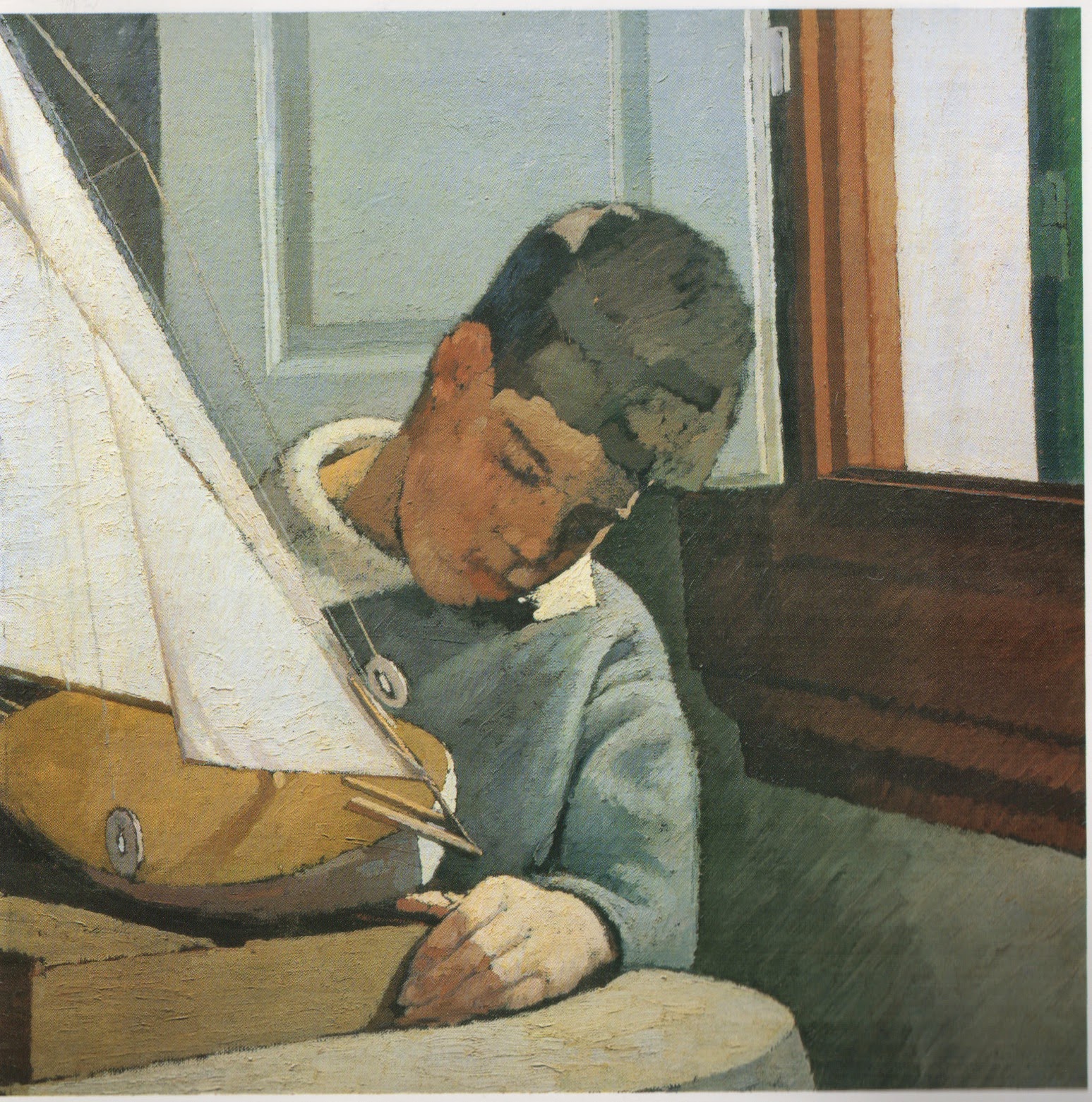

Paulo with the boat, oil on canvas 63x63, 1925?

A detail from this painting sold at Christie's in 2011


In 1914 he moves to Castiglioncello, a small town on an area of Tuscany that is characterised by a particularly clear un-hazy light, with Isa and their five children. It is a sort of nature call that agrees with his, at times paranoid, feeling of isolation.

Here he will paint some beautiful landscapes that are integral to his work. The underlying structure is there, his solid brushwork that is the opposite of "optical" impressionism; the colours are pushed away from pure realism.
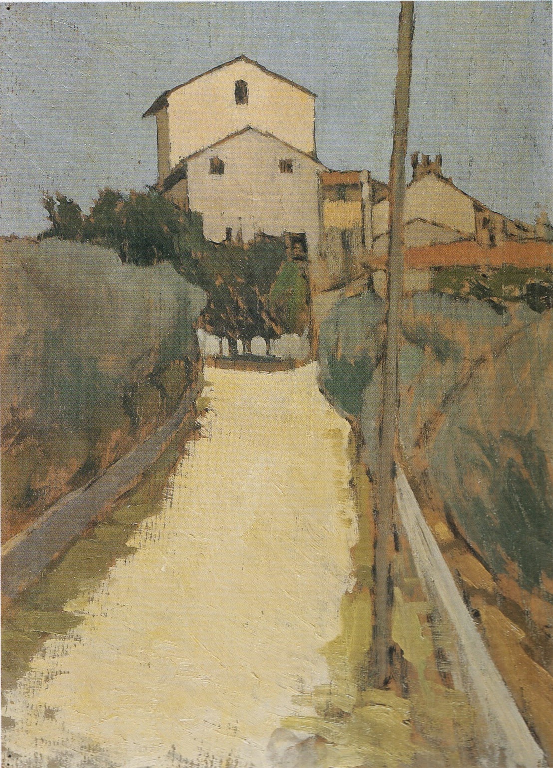


Campagna a Castiglioncello, both 12x39 oil on cardboard, 1914
These for me remind some of Uglow's landscapes.

     The format and the subjects recall the Macchiaioli painters but landscape for him is in fact a rational construction. It is not until that period that he might have come in contact with the work of Cezanne, with which he shares the concept of a painting as physical object and the use of colour as builder of form. In a letter to his friend Natali, then in Paris, he mocks the "isms" in favour of an attention to "the real" and  he suggests: " go see Cezanne: you'll be convinced that the past, yes, is the future".

View of Villa d'Ancona a Volognano, oil on panel 39x28.5, 1913/1915
an incredible forerunner of Morandi's landscapes 


The genre that will forever be his favourite though is still life. He starts painting still life around 1907, hence before ever seeing Cezanne.
Here he is at liberty of making the space he has rationally devised, here he can simplify drawing down to pure form, here he can reach that almost supernatural light ( he worked under electric light) that reveals the form entirely.

Forms are solid and there is no flickering of brushwork, even the highlights of the reflective surfaces he loves painting are thick and geometric. The colour is clean and solid but gaps in the layer show the liveliness of the luminous matter underneath.


Composition with Checked Cloth, oil on cardboard 35x49, 1923/1925
Cezannian in the way the bowl is tilted, but the shift makes total sense in design and perspective avoiding the ambiguity of planes of the French painter.

The Chicken, oil on canvas 47x60, 1910

The shells, oil on canvas 55x91, 1925/26
The Mirror, oil on canvas 50x48, 1909
The table of Mrs Ojetti with the figurine that recalls Ugo Ojetti and perhaps echoes Carl Larsson's famous self portrait.


After the Great War, to which he was too old to take part, Ghiglia will continue painting and producing many of his masterpieces, although in growing isolation.

Despite his ongoing contact with intellectuals ( his friendship with the controversial intellectual Ojetti has been seen as one of the causes for being ignored by art historians) he remained distant from politics and did not adhere to Fascism. He never really enjoyed a national success and remained anchored to local friends patronage. His house and all the objects that had appeared in his paintings were lost in a bombardment in WW2. Ghiglia died in 1945.


Self Portrait 1920


Information and images from: Oscar Ghiglia, dal Leonardo agli anni di Novecento Edizioni De Luca
Further information from: Oscar Ghiglia, L'alzatina Sforni  ( thanks to Larry Groff for this link)


Mi Blog Es Tu Blog - Sarah Jane Moon

$
0
0
Sarah Jane is the recipient of this year's Bulldog Bursary, awarded by the Royal Society of Portrait Painters. I have been following her progress at Heatherley's, where I had also studied intermittently, and I always recognise her wonderfully bold portraits that I have seen in the past months at the Lynn Painter- Stainers prize and at the "Motherhood" exhibiton of the Lots Road Group.
This is her contribution to this blog.


Nick & Amanda 2012
oil on canvas, 100 x 75 cm
Private Collection


Who are you:

I am a painter, mostly of people, and occasional printmaker.
Originally from New Zealand I studied Art Theory, English Literature and Japanese at university and have a background in running art galleries and festivals and staging exhibitions, as well as arts writing. 
I came to London somewhat accidentally, via a few years teaching small children in the Japanese countryside, a few in Perth, Western Australia studying and working in the arts and then a year or so in Kuala Lumpur. I’ve been living in London since 2008 now and it feels like home although my entire family live in New Zealand and so I try and get back when possible. It’s a place I still feel very connected to.
In London my practice mostly consists of my own painting projects as well as commissions and I work out of my Brixton studio or on location if necessary. Mostly I paint people, but I also enjoy landscape and still life, especially if connected with travel. I love detail and there is always a lot of anecdotal evidence in my paintings, especially when making a portrait. I strive to achieve some sort of formal harmony in terms of colour, line, composition and surface when constructing a picture but usually it is an exercise of fumbling in the dark and I like to remain open to what happens on the canvas.


Despite having always aspired to a career as a painter when a child and teen, I have only been painting solidly for the last 5 years. The first two of these were well spent immersed in The Heatherley School of Art’s portrait painting diploma where I was taught the fundamental skills of observation and picture making. Taught by many varied and excellent working portrait painters, the course provided valuable insight into differing styles of practice and gave one scope to experiment and be expansive in a supportive nurturing environment.
This year I received The Royal Society of Portrait Painter’s Bulldog Bursary, an award that supports and encourages an emerging portrait painter over a 12 month period and it has been invaluable. As well as the mentoring provided by members of the RP it has provided me with the means to expand my painting repertoire in terms of scale and subject matter and has facilitated several very exciting projects.


Why this one:
This painting is very dear to me as depicts two of my very favourite people: Nick & Amanda. I met Nick while studying at The Heatherley School of Fine Art and swiftly identified a fellow student who was serious about the business of painting and always keen to get on. Even now his productivity is impressive and often makes me feel positively lazy. With standards set so high that they were impossible to reach and resulted in much muttering under breath and berating of canvas, brushes, paint and self for not behaving as they should, I knew I had found a comrade in Nick. His love of poetry and characteristic wit and wry humour secured our friendship on tea breaks in the studio and we have kept in touch and remained friends since.
Meeting and getting to know his wife Amanda was a complete treat and together they are some of the most fabulously charismatic and charming people I know.
(You can see Nick’s work and read a little more about him here: http://www.nickgrayportraits.co.uk/ )
page2image22128

Something about it:
This painting was made while staying with them in Dumfries over a week or two. We tried various settings and eventually settled on the two of them in bed, which I think is wonderfully intimate and subverts the traditional formality associated with portraits of this kind. It is playful and quirky and completely reflects their somewhat irreverent sense of fun. There are small things of significance in the picture that lend to the narrative, such as the wooden mouse that was part of a wedding present and the fact that Amanda, who comes from a lineage of antiquarian book dealers and yet is very tech savvy, is reading an e-book.
The colours and decorative nature of the painting I think reflect the fairy tale like setting, which is indeed a magical place.

Technical notes:
This painting is oil on canvas, 100 x 75 cm. I stretch my own canvas mostly and from memory this is quite heavy cotton duck (15 ounce?). It was painted on site at the couple’s home (though not entirely in situ!) and mostly from photographs.

Where is it now:
It now hangs in Nick & Amanda’s London home in Chelsea.

Basic Palette:
Titanium White
Lemon Yellow 
Cadmium Yellow 
Yellow Ochre
Cadmium Red 
Alizarin Crimson (Indian Red)
Ultramarine (Cobalt Blue)

(Cerulean Blue)
Raw Umber 
Lamp Black
(those in brackets not always!)

Website:
www.sarahjanemoon.com

Sprezzatura: what does it mean ?

$
0
0
Recently I have come across this term in a book on Venetian painting and in an article about portraits. When the word appeared again in an FT article over sunglasses I felt I had ought to do something about my ignorance and investigate what it means.

Raphael: Portrait of Baldassarre Castiglione, Louvre

Sprezzatura is an Italian words but very few Italians nowadays would understand its meaning, although it sounds quite similar to "disprezzare" ( to despise) and "sprezzante" ( contemptuous).
The term has been coined by Baldassarre Castiglione, an important character of Italian Renaissance, a political counsellor and author of Il cortigiano, a manual in which he outlines the characteristics of the perfect gentleman at court. The book, together with Macchiavelli's The Prince, marks an important shift in culture, when interest turns away from medieval metaphysics and turns to society. Il Cortigiano was one of the best-sellers of the century, and Frances I had it translated in French too.


The book was written in Urbino  between 1513 and 1524 and finally published in 1528, when in Italy courts such as the ones in Ferrara, Urbino, Mantua were at their peak. Courts were not only a centre of political power but cultural hubs where intellectuals, writers, poets, musicians and artists came together.
In Il cortigiano, Castiglione talks about grace as the most important quality that a courtier should possess. The courtier was a gentleman who was supposed to know how to ride, converse, be a scholar, dance, dress up and have impeccable table manners as well as fighting skills.
All these activities, says Castiglione, must be naturally performed without effort, and this is what sprezzatura means, a certain detachment and non-chalance that should dissimulate any strain; in Castiglione's words, make the viewer believe that one just can't go wrong.
In the book he cites as an example a dancer who puts so much attention in what he does that he can be clearly seen counting his steps and is therefore an ungraceful and unpleasant partner.

Sprezzatura is relevant to painting for two different aspects.
 The book's code of conduct was promptly adopted by courtiers, who wished to be painted in a way that showed their grace and sprezzatura, so it quickly became the signature style of XVI century court portraits.
Look at Bronzino's young man in this eponymous portrait from the Met. He is aloof and self confident, at ease, elegant and not overly keen, his gracefulness looks second nature. Sprezzatura encompassed a certain melancholic indifference that we often find in portraits from this period ( is this the common root with the modern Italian words ?).


At the core of sprezzatura is not exactly effortlessness though, but the ability at feigning it, the skill of dissimulating it. This is the other aspect of its influence on painting: bear in mind that the word "arte" in ancient Italian has the wider meaning of modus operandi, and it's at the root of words such as artifice. 

Not only sprezzatura is a behavioural quality of a painted sitter, but the term can be applied to the piece of art itself, made in a seemingly easy way and almost without thinking, with non-chalant virtuosism as if it sprang not from a long and arduous training and painstaking work but purely from natural flair.
It was in those years that sprezzatura became a positive quality for the artist and nowadays we still hear the words "raw talent" enthusiastically spoken about as if the lack of effort or formal training was the most desirable characteristic. 


Roberto Calasso ( an Italian scholar) sees Tiepolo as a perfect example of an artist who practices sprezzatura: light and fluid touch, fast execution, confident and flamboyant brushwork. 

I wonder which modern artists might be considered to have sprezzatura, to produce work that is seemingly easy and has a lightness of touch and a playful grace to it and Matisse is the first one that comes to my mind.


The link with sunglasses is still eluding me though.
For more arty words check this other blog post from a while ago. 


Royal Society of Portrait Painters Annual Show - My works

$
0
0
I am very happy to have two works selected for the RSPP show at Mall Galleries, London. I have been selected for a number of years and every time I am very grateful to the society for allowing me to be part of this beautiful show.

The core of the show is made by members of the RSPP but every year about 100 pieces are selected from open submission. This year I have entered a painting and a monotype and they were both selected.

I was very excited that the small (10x10cm) monotype  "Study for the Queen of Sheba" was chosen. Monotypes are a fairly recent endeavour of mine and although I have been showing them already at art fairs this is the first time that they are included in an important show.


This small portrait of Fre' is one of about twelve monotypes I made of the same subject and size, and the only one that did not end up in the bin. Although the execution of a monotype is rather quick, the risk of failure is high, particularly in such small works. Not that this one is perfect but it's the best I could do.
I like making monotypes based on my own paintings, it takes the pressure off "finding a subject" and viewing the work at a different scale and in reverse helps me understand much more about the painting itself.


The oil painting that will be on display is from a "portrade": I sat for Daniel Shadbolt for a few sessions last January and in turn he came to my studio three times. He just sat as he was, with his jacket still on.
Half way through the sittings I decided to include in the background one of his paintings which I own and love, an urban garden with a lonely chair and a shed ( that " looks back", in Daniel's words).

A few weeks ago at the National Gallery I spotted this painting by Moroni that I had always overlooked: an uncanny resemblance !


The Royal Society of Portrait Painters Annual show is open from the 8th to the 23rd of May at Mall Galleries.

Four shows

$
0
0
I have many friends exhibiting in London these days !


I have met Lucy Powell years ago in painting classes. She was always a very good painter but in recent year she has progressed even forward by following more classes and experiment fearlessly, and her work has become bolder and more free. Lucy, together with the painter Annie Field, is showing her work this week at The Studio, 73 Glebe Place, London. Just off the Kings Road, the show will be open until the 21st of May from 11 to 7pm.


Adele Wagstaff has been painting the Rehearsal Orchestra for many years now. The paintings and drawings she has produced in this period are now on display at St. John’s Waterloo, Waterloo Road, London SE1 8TY until the 5th of June ( 10 to 6 closed on the 26th of May). 


Daniel Shadbolt  is showing a large number of works at 286 Gallery in Earl's Court. Daniel is a very sensitive and dedicated painter whose work is gaining increasing recognition. Having had the privilege of seeing him painting in a number of occasions I admire how he is always ready to make changes, some times radical ones, painting with relentless concentration and energy.
The show "New Paintings" will run from the 10th to the 30th of June  at Gallery 286, Earl's Court Road.


Kim ScoullerandDavid Caldwell are currently showing together at the Caledonian Club in Belgravia. I have been following Kim for a while and I enjoyed the show very much, I particularly liked her self portraits. Her fellow Scot David Caldwell is showing a series of beautifully observed and lyrical London landscapes. The show is open until the 8th of June at 9 Halkin Street, Belgravia.  ( by appointment : Eilidh McCombe emj@caledonianclub.com or 020 7333 8722, no jeans, shorts or trainers)


Mi Blog Es Tu Blog - Kim Scouller

$
0
0
   

I met Kim a couple of years ago as we painted together sharing a a model, and I admired her powerful paint handling, particularly in the small scale. Selectors for the BP Portrait Award have spotted her very early when they chose her work for the 2003 show - I remember admiring this painting back then ! Her recent London show at the Caledonian Club was excellent.
I am glad she has chosen this particular painting from that show, it was my favourite because of the strength of the image and the perfect mastering of the square format :


Self Portrait, oil on panel 30x30 cm


Who are you?

I am a painter living and working in London. I grew up in Scotland and made the move south 7 years ago to study on the 'Drawing Year' at the Prince's Drawing School. While I was there I met lots of wonderful like minded people and I've been here ever since.

Why this one?

I chose this painting because it was the last work I made which surprised me. I'm always looking for a new way of seeing and this painting allowed this to happen.


Something about it?

I made this painting in April while staying at my parents in Scotland. I have made many self portraits over the years, I use it as a way of engaging with myself and the painting process; experimenting with ideas about paint and what it can do. Most of my breakthrough paintings were probably self-portraits. In this particular one I was experimenting with using a black ground. I found it really difficult at first, every mark I made was in a completely different key from what I thought I was mixing on the palette. I often work with different coloured grounds, I'm excited by the colour vibrations you get when it goes well. I'm always trying to find the right balance in keeping an energy and openness in the handling while also trying to define the subject without losing the emotion.

Technical notes :

This picture is oil on panel (30 x 30 cm) which had been primed with blackboard paint.


Where is it now?

It's on show at the Caledonian Club, Belgravia (www.caledonianclub.com) in an exhibition called Two Scottish Painters with another Scottish artist David Caldwell. ( by appointment : 
Eilidh McCombe emj@caledonianclub.com or 020 7333 8722, no jeans, shorts or trainers)

Basic Palette :

My palette changes but I tend to stick to using :

Titanium White
Naples Yellow
Lemon Yellow
Cadmium Yellow
Cadmium Red
Alizarin Crimson
Cerulean Blue
Ultramarine Blue
Viridian
Paynes Grey


For more MBETB blogposts click on the tab at the top.

Mi Blog Es Tu Blog - Sam Dalby

$
0
0
Lots of shows opening these days, among them an exhibition of works by Sam Dalby, whom I recently met at the opening of the Royal Society or Portrait Painters Show. Sam was elected a member last year and his beautiful portrait was hanging very prominently in the show.
His solo is opening this week at Gavagan Art  in Settle ( North Yorkshire).

I am glad that he decided to write about this pivotal work :


WHO ARE YOU  
Sam Dalby, Yorkshire based portrait painter who spent many years as a painter and decorator, fantasising all the time about doing what I loved for a living. Attended Harrogate College of Arts and Technology, Cleveland College of Fine Art.

WHY THIS ONE
 It's a painting that I love every inch of, flaws and all. It had a long and troubled gestation, and was the first painting of mine that survived and emerged stronger after such a gruelling process.

SOMETHING ABOUT IT
This painting was started in 2009 as a large charcoal drawing of a Eliza, a young spirited and beautiful older lady. The drawing itself had to be extensively re-worked, cut down, spliced, and extra sittings demanded for repositioning the hands.
I transferred it onto canvas, blocked it in, and painted diligently from the sketch for a few weeks. I thought I was not far from finishing, when I received a lot of severe criticism (some of it valid) from an artist I went to for advice. This set off a crisis of confidence, and on returning to the picture, hated it so much that I painted it out with a dark wash, which I wiped away until Eliza could just be seen peeping out of the mist. I slowly started back working from the sketch, and realised after a month that it just wasn't working. After a few months break, It dawned on me that a lot of the problems I was having stemmed from the odd shape of the canvas, and the unstable way the figure sat on it, so I cut it down and re-stretched it on a stretcher that was the same width, but not as tall. I painted another dark glaze over the work, and called Eliza up for more sittings.
By now it was mid 2010, and sittings continued on and off for another year, as the painting inched its way forward.
Towards the end of the sittings, the painting changed from being a ground down and overworked mess. Passages of paint started to make sense, colours began to hit the right notes, a sense of light illuminating the flesh appeared. Slowly, Eliza's character became manifest in the paint, the delicate features began to carry the underlying apprehension, an old lady still with the naivety of a teenage girl.
No portrait since this has had to go through this pulverising, attritional process. It was the painting where I became a problem solver, where I learned the value of good planning, the value of perseverance, and where I finally began to understand in a profound way how to create life from paint.

TECHNICAL NOTES
I cannot remember what the specs of the original canvas were, but it is a heavy cotton, double primed with an acrylic primer.

WHERE IS IT NOW
Sitting at home. it occasionally goes out to exhibition, where people admire it and never buy it.

BASIC PALETTE
My palette at the start of the painting was a grisly affair, but had settled down into a recognisable tonal painters palette by the time I'd finished:
Titanium White 
Lemon Yellow
Yellow Ochre
Venetian Red
Alizarin Crimson
Cobalt Blue
Ivory Black


For more MBETB posts please click on the tab above.
Viewing all 85 articles
Browse latest View live