Quantcast
Channel: Ilaria Rosselli Del Turco - News
Viewing all 85 articles
Browse latest View live

A Landscape, a Project, a Workshop and an two Art Fairs.

$
0
0
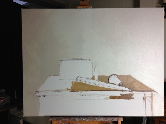
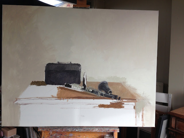
I have had a long Mediterranean summer visiting my family and now I am back in London ready for the next busy months. I haven't been painting much while I was away but I still managed a couple of oil sketches that I am turning into larger works.
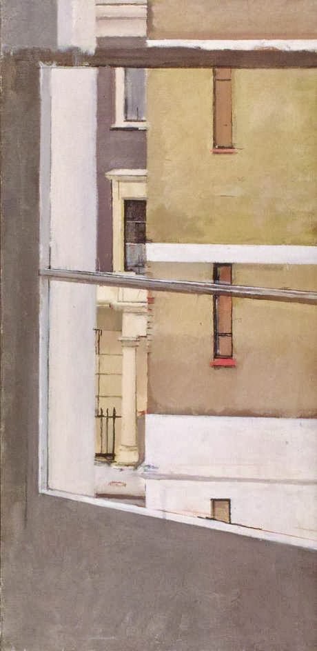
What I found out about landscape painting is that it is indeed possible for me to get engaged with it as long as I have a deep and meaningful connection to what I am painting.

This was painted from an oil sketch, a drawing and a black and white photo of a stretch of coast close to my birthplace.

A Place of Untold Secrets, 102x87 cm, oil on linen


  _________________________________________________________________________________

I also have been very busy with, yes you guessed, Print Solo ! The website is almost ready to go online and soon it will start accepting applications from potential sellers. If you don't know about Print Solo yet ( how is that possible?) here's a video that explains what it is. I am entirely to blame for the idea and its execution.


_________________________________________________________________________________

Because of my involvement with Print Solo I have stopped teaching regularly but I will be doing a weekend Masterclass at the Art Academy in London on the 10th and 11th of October. I will try to cram as much information as possible in those two days, talking about palette, composition, tonal range, paint application You can find all the info here. If you wish to attend please book well in advance.
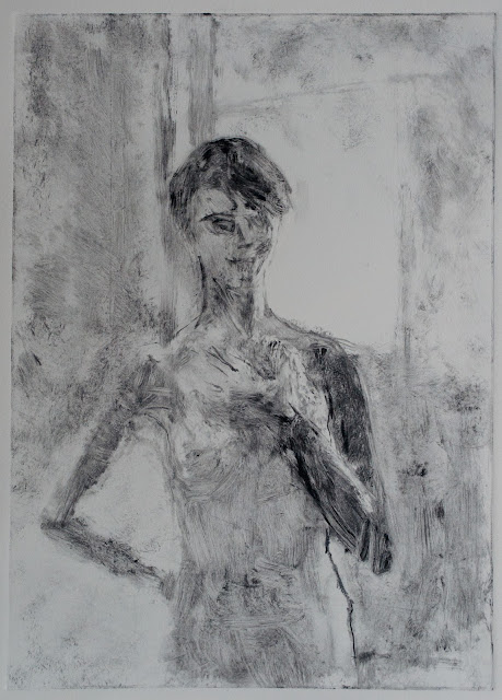
A recent commission: G., oil on panel, 40x50cm


_________________________________________________________________________________

And finally my very nice gallerist Kathryn Bell from Fine Art Consultancy will be showing one of my works at the 20/21 British Art Fair at the Royal College of Art in London next week. It's always a very good fair with the best galleries that deal in British art. Please get in touch if you want a free invitation to print out. And next week the ubiquitous Kathryn will also show my work at the Affordable Art Fair in New York.


Art Podcasts

$
0
0
If there's one thing I really force myself to do this is going to the gym. I know it's good for me but I really find it utterly boring and I am so good at procrastinating that I manage to find myself there around 7pm when it's crowded with youngsters literally letting off smelly steam.
Because of the random nature of my studio days, my general grumpiness and impatience, I don't go to classes where you are supposed to elegantly elongate your muscles, breath in breath out, nor to those where you are supposed to keep up with some frenzied individual with a mic.


I'd rather do my thing and that's when listening to some engaging conversation has the magic power of keeping me on a tedious rowing machine beyond my first sweat. Enter the arty podcast, an audio program that is just long enough to last one gym session ( or a good walk).

I prefer listening to podcasts when I am not in the studio, as some of them are so interesting that they actually distract me from painting. Actually some times while I work I listen again to the ones that I found more inspiring or motivating to see if they generate ideas or throw new light on the painting I am working on.
I am really amazed at how articulate and clever painters are, and I often recognise my mental processes in podcast conversations, normally much better verbalised than when I formulate them.


So if you are not already an adept of podcasts here are a few you might enjoy. You can listen while you are online or download them on your device through these websites or on iTunes.


- The Royal Academy 
Features academic introductions to shows by curators or artists, interviews and conversations.
The recent conversation between Tim Marlow and  Frank Auerbach is probably THE perfect podcast.

- The Newington-Cropsey Cultural Studies Center 
Features a variety of artists in conversation with the art critic Peter Trippi. Includes artists such as William Bailey, Lois Dodd, Gillian Pederson Krag and my friend Alexandra Tyng.

- Studio Break
It's a new find for me, I got there following the guys from Printeresting, a printmaking blog, and had a look around to find two interviews with FB friend Joe Morzuch so started listening. The interviewer, artist David Linneweh is very good at conducting the conversation and asks the same questions I would ask.

-Savvy Painter
Features artists in conversation with painter artist Antrese Wood. She touches on practical aspects of painting such as promoting the work, as well as asking interviewees about their career path or their daily studio practice. Artists that have been interviewed include Israel Hershberg, James Bland, Stuart Shils, Mitchell Johnson, Stanka Kordic, Karen Kaapke, Dean Fisher and many others.

-Suggested Donation
Generally more focussed on classically trained artists, and at times a little laddish. I recommend the Vincent Desiderio episode.

I hope you like my selection. Alternatively you can go to this cardio class:


Book Review - Italian Renaissance Courts: Art, Pleasure and Power

$
0
0
 

 I was recently sent this book by Alison Cole, an art historian and journalist, about the relationship between artists and courts in Italian Renaissance.
The book provides a very precise backdrop to the artworks that we know and love from that period.
I am always interested in the context in which a painting was made, I find that it matters as much as, if not more than, the subject. It was something I noticed when I went to see the "National Gallery" documentary by Frederick Wiseman, that most explanations about paintings were focussing on the subject while technique and context were seldom mentioned.

   In the past I have posted about the complicate interpretation of Piero's Flagellation providing a summary of Silvia Ronchey's book about it, and also tried to give an explanation of the term "sprezzatura", which was born in that period and is so relevant to the art and culture of Italian courts.
Cole's book refreshed and deepened my knowledge on the differences between all the distinct cultural hubs that coexisted in the peninsula during those extraordinary centuries.

   It is easy to forget that there were profound differences between communities that were only a few dozens of kilometres apart, like the courts of Urbino and Ferrara for example: one fortified and based on military strength and all centred on the figure of the mighty Duke Federico, brave and cultured; the other at times defeated but more open to communications and pervaded by poetry, music and chivalric ideals coming from the North.
If we are aware of these characteristics, it is easier to understand how the luminous, solid and rational space in Piero could be painted just a few hours away from the hyperbolic metaphoric one imagined by Francesco del Cossa in Palazzo Schifanoia (the frescoes featured in Ali Smith's excellent novel "How to Be Both" btw), although they were both "sons" of the ubiquitous Pisanello.

  It was a real pleasure, as I opened the book, finding a painting by an artist belonging to my family. Francesco Rosselli was the half brother of Cosimo and mainly known as the author of an important document, a painting that chronicles the entry of Ferrante d'Aragona's fleet in Naples after his victory over the Anjou. The painting had probably been commissioned by the banker Filippo Strozzi who helped finance the expedition and wanted to consolidate his exchanges with the Neapolitan king.


   The book is pleasant, with a lot of illustrations,  and also offers information on the character of the princes and their heirs, the dynastic intricacies and pecking order within the courts. A good read.


Article 0

$
0
0
I am re-publishing here a series of article I wrote for the magazine section of Print Solo.
They are about printmaking rather than painting of course, but I think they can be interesting for artists.


WHY DO ARTISTS MAKE PRINTS/1


Since I founded Print Solo I realised that even people who are very interested in visual arts don’t have a clear idea about what printmaking is. The main element that they retain, I found out in conversations, is that it allows artists to make more than one copy of a piece. In an age in which technology can reproduce paintings and drawings with stunning fidelity then, ( did you see the Borgherini Chapel reproduced with 3D printing techniques for the Michelangelo and Sebastiano exhibition at the NG in London?) why not just go for digital reproductions, why do artists keep making original prints ?

The answer is of course that printmaking is not, or not just, about multiplication, but that the process involved in the various techniques is unique and has been fascinating visual artists for centuries.

In a recent talk in which I was introducing Print Solo I reflected on what some of these peculiar elements of original prints were, and the first one that occurred to me was the gap between the work of the artist and the birth of the print.
As you might know, in order to produce an original print the artist works on a matrix that is of a different material than the artwork itself: the print is on paper while the artist has been in fact carving a piece of wood, or cutting into plastic, or engraving a metal plate.
The artwork takes its final shape not under the hand of its creator but at a different time and place, when the tools have been put down and the object they created has been inked and is passing through a printing press.

These degrees of separation between the artist and the artwork have the effect of producing a surprise, a moment of real thrill when the paper is lifted from the matrix after having undergone the small journey on the printing press bed.
In the words of William Kentridge, a keen printmaker, at that precise moment the artist as a maker is left on one side of the press and the hands that peel the paper off the plate are the ones of the artist as observer. The surprise is further enhanced by the reversal of the image.
The metaphor that comes to my mind is that one of a person meeting an adult offspring they didn’t know they had, and looking hard to search for familiar features, for a resemblance to the other children.

Printmaking can introduce novelty and unexpected results, which in turn may feed works produced in a different medium. It can teach the artists something about their own practice, offer some insight. Also, the delight of seeing one’s own work with new, fresh eyes, of experiencing it as a viewer, is an almost addictive feeling one wants to relive again and again: when printing an edition or by periodically returning to the printmaking studio.


Evening in the Studio, mezzotint ( 20x15 cm)
Available on Print Solo
 

Mi Blog Es Tu Blog - Kim Scouller

$
0
0
   

I met Kim a couple of years ago as we painted together sharing a a model, and I admired her powerful paint handling, particularly in the small scale. Selectors for the BP Portrait Award have spotted her very early when they chose her work for the 2003 show - I remember admiring this painting back then ! Her recent London show at the Caledonian Club was excellent.
I am glad she has chosen this particular painting from that show, it was my favourite because of the strength of the image and the perfect mastering of the square format :


Self Portrait, oil on panel 30x30 cm


Who are you?

I am a painter living and working in London. I grew up in Scotland and made the move south 7 years ago to study on the 'Drawing Year' at the Prince's Drawing School. While I was there I met lots of wonderful like minded people and I've been here ever since.

Why this one?

I chose this painting because it was the last work I made which surprised me. I'm always looking for a new way of seeing and this painting allowed this to happen.


Something about it?

I made this painting in April while staying at my parents in Scotland. I have made many self portraits over the years, I use it as a way of engaging with myself and the painting process; experimenting with ideas about paint and what it can do. Most of my breakthrough paintings were probably self-portraits. In this particular one I was experimenting with using a black ground. I found it really difficult at first, every mark I made was in a completely different key from what I thought I was mixing on the palette. I often work with different coloured grounds, I'm excited by the colour vibrations you get when it goes well. I'm always trying to find the right balance in keeping an energy and openness in the handling while also trying to define the subject without losing the emotion.

Technical notes :

This picture is oil on panel (30 x 30 cm) which had been primed with blackboard paint.


Where is it now?

It's on show at the Caledonian Club, Belgravia (www.caledonianclub.com) in an exhibition called Two Scottish Painters with another Scottish artist David Caldwell. ( by appointment : 
Eilidh McCombe emj@caledonianclub.com or 020 7333 8722, no jeans, shorts or trainers)

Basic Palette :

My palette changes but I tend to stick to using :

Titanium White
Naples Yellow
Lemon Yellow
Cadmium Yellow
Cadmium Red
Alizarin Crimson
Cerulean Blue
Ultramarine Blue
Viridian
Paynes Grey


For more MBETB blogposts click on the tab at the top.

Painting Process

$
0
0

For once a post on a painting I am working on right now. Since my new phone has a good camera it was quite easy to take some photos in progress.
    It's been a while I wanted to paint one of my my sons' clarinet; it's been living in its case for the last few months, as he has dropped out of his music lessons. I too dropped out of my piano lessons as a child but I clearly like activities in which one focuses completely !
   
    The instrument is beautiful and complicated and it is important for me that as a subject it has been endorsed by Chardin, Picasso and Braque. In order to create relationships in the painting I set up the main body with the mouthpiece and  bell separately, and I added the case as a strong tonal element ( husband said: "What I don't understand is why you had to include this black radio, guess it needs repainting"). The setting is on a small cabinet, a regular extra of my studio cast of characters; the light strikes it from the right hand side. The canvas is large and provides breathing space for the still life.


     In my studio I intentionally blocked out the cool northern light. I prefer to deal with the difficulties of changing colours and moving shadows in order to paint in the warm southern light I miss so much.


     I worry a little bit at this point that the painting has no "colour", but it is now that I providentially happen to have a chat with the artist Roni Taharlev. I mention to her that I have doubts on this aspect of the painting and she replies: "But I love black ! Think about Duccio. In other Madonnas you have the impression of worshipping the dress, but his stark black veils...". That was all I needed, a little word of wisdom and reassurance !


     I make a quick drawing of the intricate key works of the clarinet to understand proportions better, I would like it to look "right".
I keep going with the painting trying to understand the ellipsis on the bell of the instrument and to find a good rhythm in the negative spaces.


I like very much my little cabinet, its ornate front is a good solution to the problem of the support, the plinth for the setting. I like this limited surface where the object is often placed close to the edge of its world. When I open the drawer Chardin shows up in the work.

    As I proceed with the work I feel very unsatisfied: something is missing, the whole thing is just too simple. The idea of the unplayed instrument is still there and I start thinking about the small "musical cemetery" we have at home. I decide to add the abandoned trumpet and the handed-down guitar, the painting is almost becoming a family portrait, the quiet one, the gentle one, the boisterous one.


    As the other elements are added there is clearly an unbalance towards the right. I gradually understand that the problem is with how I set up the clarinet. I don't want it to come out of the plain, to protrude out of the painting, it needs to be parallel to the surface, it belongs to that other world.

No fear, then. Scraping and repainting. 


This is the current state of affairs, but more work to do...


Michael Andrews, Artist

$
0
0
This blog gets several hits from people who are googling the painter Michael Andrews, whom I mentioned in this post. I thought I'd write about him and add a few links to his works.

Michael Andrews has a rightful place among major British artists of the late twentieth century. He was famously a very slow painter, which is why, if you are looking for his work on line, you won't find much: simply because he didn't actually produce a lot. His comprehensive retrospective at the Tate in 2001 included 95 paintings made over 45 years.

Michael Andrews was a student at the Slade and friend of the artists in Swinging London: Lucien Freud, Victor Willing, Frank Auerbach, Francis Bacon, Leon Kossoff.
 He was particularly fascinated by the work of R. B. Kitaj, who as an American was a bit of an outsider, and was the one who identified the " School of London" as such in the introduction to the show "The Human Clay"in which Andrews' work was included.

Although very different, these artists all shared a preoccupation with the human figure and the practice and process of painting. These two issues are present in all of Andrews' works.

I am using the catalogue the Tate show as the basis for this post ( thank you Alex for lending it to me).
His production can be split in four major groups of paintings, to which we need to add his early works and his portraits.

Early works:


A Man Who Suddenly Fell Over, together with August For The People are his most significant early works, painted in his final year at the Slade and both inspired by poetry. Andrews' work always mantained closed links with literature.
Other beautiful and remarkable paintings from this period are Man in a Landscape ( Digswell Man II), Little Boy Running and Lorenza Mazzetti in Italy.


PARTIES:
Study for The Colony Room, 1962 ( 31x48cm)
The painting "Late evening on a Summer Day" prefigures his famous parties paintings from the Sixties. As an observer of London social scene, Andrews embarked in a series of works depicting groups of figures in social occasions. He painted the Colony Room, a club in Soho that was a meeting point for people from the literary and artistic cliques.
I have to say that these are my favourite ones. He sourced figures from observation and from all sorts of printed material like magazines, catalogues etc. 


 In The Deer Park ( 214x244cm, title from Norman Mailer) Rimbaud features as the central figures. These works are about human relationships and interactions. Characters are observed from the outside, one can hear the buzz of the evening.  Monroe, Bardot and Ian Fleming also appear.


Study of a Head With a Green Turban ( I saw this and other Andrews paintings at the beautiful show The Mystery of Appearance at Haunch of Venison gallery, London, last year)


"The Lord Mayor's Reception in Norwich Castle Keep on the Eve of the Installation of the First Chancellor of the University of East Anglia" was a commission. The picture is painted on top of a collage of photos, there's clearly some social satire involved !

The seed for the following series of works is Good and Bad at Games ( now at the National Gallery of Australia in Canberra) where the characters, among which Paula Rego, her parents, Victor Willing, Andrew's wife June, Craigie Aitchison, look like inflated or deflated balloons tethered over a silkscreened background. The painting is a commentary on the mutual influence of people in social interactions, the idea they have of themselves in relation to others.

LIGHTS:
The new series, 1970/1975 has a balloon as main character. It represents the ego and reflects Andrews interest in Zen philosophy. The human figure is not painted but still present, as a silent observer of the haunting scenes and as the passenger of the balloon, floating over land and water.

Lights II: The Ship Engulfed 183x135


A progressive liberation of the self is depicted, a journey of illumination where the artist will ultimately  reveal things "as they are".
The series comprises only seven works. Frank Auerbach said that although Andrews did not produce many works, "he only painted masterpieces".

Lights VII: A Shadow, 182 x 182


SCHOOL
Identity and relationships among members of a community, are the themes of this series ( I think they should be called series rather than group as, like the ones from Lights, are numbered progressively).

Andrews continues to use a technique he had debuted in Lights, the spraying gun, perhaps another way of losing the "self" of the painter.

School IV: Barracuda Under Skipjack Tuna, 175x175


Melanie and Me Swimming 1978-9

HOLIDAY
In the late Seventies Andrews started to spend his holidays in Scotland, where he painted the estate of his hosts and went stalking. He was intrigued by the ritual of this ancient activity and produced many works from photographic records.

Give Me The Rifle...!
6.30 pm 17th October Glenartney
30x40cm
The Forest Beat Through a Telescope 35x40


ROCK OF AGES CLEFT FOR ME
Another very famous series of large paintings stemming from a 1983 trip to Ayers Rock in Australia. Keep it big, keep it simple, be bold said a sign in Andrews studio. The paintings of this sacred place were executed upon his return in England. The title comes from the lyrics of a religious hymn that resonated with the particular interdependence between man and environment Andrews found there.


Laughter Uluru( Ayers Rock)/The Cathedral, I 228x274


LATE PAINTINGS
Landscapes of the Thames, in which paint is manipulated in a way that is akin to the subject: diluted with turps is poured on the canvas on the floor and moved around.

The Thames at Low Tide, 182x167

 Figures taken from Victorian photographs are added in the final work , The Thames Estuary.
In this period Andrews painted a series of beautiful heads of friends and family.


Michael Andrews died of cancer on the 19th of July 1995, aged 66 years.


Further readings: some very interesting essays on the School of London and what ties them together is in the catalogue of the collection amassed by Elaine and Melvin Merians, a couple of Americans who fell for these painters and owned pieces by all of them.
The eminent architect Colin St. John Wilson was a friend and a collector of Andrews work ( his collection is on display at Pallant House, Chichester, UK). Andrews painted his portrait in 1993/95 and he wrote about sitting for Andrews, as well as for Coldstream, in the book The Artists at Work.


Monotypes/1

$
0
0

   This year I finally fulfilled a resolution I made a couple of years ago after watching this video of Stuart Shils making monotypes. I had the privilege of meeting Stuart a couple of years ago and was captivated by his work, and I often look at his catalogues just to remind myself of the impact that a flawless use of colour has. Until this video I had come across the word monotype but I didn't really know what it was.

View part 2 of this video here


       I had done a little bit of etching in my twenties, and used to enjoy everything about it. In fact I was studying illustration at the renowned printing house Il Bisonte in Florence, and the printmaking was what I really liked best of that year and what stayed with me. After that course I bought a small printing press with which I worked for a couple of years in Italy. Kids and acids don't really go together so I put my kit away twenty years ago.
The first thing I realised when looking at Stuart's video was that the acid part of the printing process was missing and that it seemed like something I actually could do in my studio.

When I read that the Prince's Drawing School was offering a montype course, tutored by Mark Cazalet and Henry Gibbons Guy, I signed up straight away.
We are now halfway through the course so I thought I would post some of my works.
I am sure I have annoyed both tutors with my swot behaviour but I just completely fell in love with this printmaking technique. I am keen to learn and understand as much as I can so I can then work on my own.

What captivated me in this form of printmaking is the contiguity with oil painting: printing inks can have a flat quality and an intensity that recalls the feel of oil, they have a certain body and they show the brush marks. There's an element of surprise every time because there are many variables so it's not easy to predict exactly how the ink and the paper will behave, and then of course the image is reversed so looks totally new and unexpected.

During the first lesson we were shown some examples of monotypes by the masters and introduced to the most simple monotype technique, for which there's no need for a press. Gauguin and Klee produced some works in this way, some call it trace monotype.
The zinc plate is completely or partially inked with a roller and a sheet of cartridge paper is placed on top of it and secured with some tape on one of the sides ( essential if one needs to lift the paper for checking the print). A drawing in pencil is then made on what will be the reverse side of the print and the ink would transfer to the paper by the pressure of the pencil.


The difficulty here is that I needed to push on the pencil so the lines are drawn slowly and clumsily, and of course there's no coming back once a mark is made. One can also push on the paper with the hand to create a tone. 

You will recognise this technique in Tracey Emin's monotypes as well, its charm is in the softness and " hairyness" of the line. I have tried it at home with rice paper, it's fast and easy to set up - ink, plate, roller and paper is all that is needed. 
In the next post, enters the printing press.


Monotypes/2

$
0
0
The second and third lessons in the course is where things got really interesting. We looked at Degas and worked with the techniques he used in his stunning monotypes.
Examining Degas from up close one keeps finding extraordinary touches, the most sensitive marks and sophisticated composition choices. 
Humbled by this example we proceeded to ink our plates and worked in the "dark manner" or "dark field" technique, which means proceed by removing the ink. 
The plate needs to be covered by a good layer of ink which can than be wiped off with a bit of cloth or moved around with a brush ( the stiffer the better). Vaseline and cooking oil can be used ( sparsely!) to thin the ink and clean the plate. The plate is then placed on the etching press and printed on hot pressed watercolour paper.


I have to say things were made much easier by our model who had a strong presence and was set against the light thus being in strong contre-jour lighting.


When working on the plate it is quite difficult, particularly at the first experience, to predict the result. The darkness of the print depends upon the quantity of the ink, how dry it is and also on whether one chooses to print on wet or dry paper. Once printed a first monotype there is still time to rework the plate without having to obliterate the work previously done, and obtain a second pull.
Blotches of ink are always a danger because they are not very easy to spot on the inked plate and on the paper for a very dark flat stain, but I have to say that perhaps because of the slight improvement when the print is dry, or perhaps because after the initial shock one gets use to how the print looks after a while, I now notice them less.


This is another couple of prints from the last pose of the day. The lessons take place in the beautiful studio the chool has in Kensington Palace ( no I didn't bump into Prince Harry yet ) and there's a strict discipline. We start on time at 10 and plough on until just before 5 pm, lunch break is well timed and no phones allowed in the studio, so the concentration is intense.
As it happens often the best works are done towards the end, when weariness takes over and I am in a hurry to finish. I like these last two as I think I really loosened up.


In the second print from the same plate I started making marks in all directions ( compare with the first prints where most marks are vertical) and I had the feeling that I was really moving the ink round with an illusion of control. 
As I peeled the paper from the plate I realised an accident had happened and something quite wonderful appeared. While in the first print I had carefully produced a good likeness of the model's head, in the second one I was being less specific and I wanted to treat the head with the same energetic marks I had used in the body without realising that there were some little blobs of ink.
After a first disappointment at the black blotches I became aware that one could read something else and that a man with a weird ferret mask had appeared. I am very fond of this mistake now !!


Monotype/3

$
0
0
     In the next session we were looking at Degas again and encouraged to experiment with the positive version of what we did the previous lesson, which meant literally paint with the brush on the polished plate. The ink can be thinned with cooking oil or vaseline.
 Although it might seem easier than wiping away ink, we all found it harder. I think this was basically because of the difficulty of manipulating ink and forecasting what the print will look like. I think it is a bit like painting on an imprimatura, it's easier at the start.
Both tutors went very much in depth analyzing the depiction of space and light, the dynamic use of the brushwork and the composition and the tonal balance.


We work under time pressure because the ink is drying, even more so when one is painting with a thinner layer.
With this technique it is easier to use a range of marks, working with a brush ( hog) or dabbing with a cloth.


Again I was quite surprised when I printed this one, it reminded me of the atmosphere in the drawings of Karl Hubbuch, a German artist who showed at the "Neue Sachlichkeit' show in 1925. 

I bought a book of his drawing ages ago and I always loved this work. Christopher Isherwood has always been one of my favourite writers and this drawing for me embodies the spirit of that time.
It's strange some times how images resurface in the work without one being aware until later on.


In the afternoon we worked on two plates, so we had the chance to work on a larger format. It was interesting to include both the model and a bit of landscape from the garden. 


These are the two separate plates, and again I re-worked and re-printed afterwards.


Monotype/4

$
0
0
Oh well, sooner or later I had to have an off day...
While everyone was producing really nice works, I did very bad in the fourth session. The artist we looked at was Matisse and some beautiful prints with a simple white line on pure black ground.


Matisse


The major difficulty for me was that I was always terrible at work that veers toward graphic as opposed to painterly I am not gifted with an ability for synthesising, as you might understand from my verbose posts !)
I can probably manage line when it is accompanied by tone, but line on it's own I find it difficult and I get very frustrated. On top of this we were working with a white line on black: now, for me white signifies light, so my tendency was to use the line to pick out the lights. What I should have done though was using the line as contour, so to mark the darks with a white line as well.


I always see in terms of darks and lights, this was an impossible situation for me, and I threw a tantrum on the plate and started scribbling furiously all over.

I basically scribbled until the morning was over, the only good element I got from this exercise was experimenting with the initial inking of the plate. In this larger plate ( right) I only lightly inked the sides of the plate so that I could have some texture and shades of gray as a background of my line.


In the afternoon we worked on a double plate again but what really cheered me up was that I managed to produce some prints at home !
I pulled out of the cupboard my small old etching press: a bit dusty and rusty after fifteen years of oblivion a but still working !


I worked on a copper plate ( I learnt they are more delicate than zinc but because they are polished the surface is more slippery so ink application is smoother ) and these are my first efforts. The first and second ones are from Muybridge photos, the third and fourth ones are form drawings of Pontormo and Rembrandt.


Next week, colours !


Monotypes/5

$
0
0
Colour !!!

Colour made its appearance today.
We had some earth colour available to work with today, ochre, burnt sienna, black, raw umber, and later on some blue.

I worked with positive technique but I now learned to combine some inking of the plate with the roller that I can use as a light background and unifying layer as I did in this three colour print


Also, coloured inks have their own personality one needs to learn, just as oils. Umber is weak and dries fast, the ochre was very difficult to manage as it had a tendency to splodge. I guess that one slowly learns and reins in their behaviour. I charged on for the first print with ochre and black but hit a brick wall: I intended to use black as my cool and ochre as my warm but it didn't quite work out: of course, there was no white to mix the black with !


Adding colour was indeed very complicated as inks are different in use both from watercolours and oils. Yes of course they can be mixed but it's very difficult to predict the intensity of the tone, so one is never sure how dark the area you are paintig will turn out in the print.

I am left in doubt on whether colour adds something to this method of work, and if the same prints would have looked better in monochrome, but that's the whle point of a ten weeks course, to learn about all the tecniques so that one can choose. 
I have to add that the input of the tutors on matters of composition, luminosity, mark making and many other aspects is invaluable, really a course worth attending ! 

Three prints from the same plate reworked in between pulls:


Monotype/7

$
0
0
This is the last post following the progress of my monotype course. In the latest classes we experimented further with coloured inks, embossing, offset printing.
After starting out with earth coloured inks, we were then given saturated colours: cadmium yellow, cadmium red and a very tinting cyan. These can be used on their own or mixed, and they can either be painted on the plate at the same time or one at the time.
It was interesting to work with pure colours but very difficult for me, and I didn't really produce any passable work.

In order to produce a print with several colour layers we learnt offset printing, a technique that allows one to work with one colour at the time and printing them opaquely one on top of the other.
Monotypes can basically be printed once, and after that some ink remains on the print: barely enough for a second print but definetely enough to get mixed up with subsequent layers.
With offset one can transfer a very faint trace ( ghost image) from one plate to the other so that the image can be cleanly reworked and printed again on the same piece of paper.
Offset is much more complicated to describe than to do, so I won't venture in all the passages here ( take the course!).


Other techniques we have been experimenting with have been printing patterns with different materials such as netting, lace or corrugated cardboard. These can be used also to emboss the paper and obtain different effects.  We also have tried working with white opaque ink over black sugar paper, and using it on warm rose paper to produce highlights.


I was very happy to be back at the printing press after twenty years, now that I have more experience with producing images.
I have coined a phrase for printmaking, that the plate is the ultimate battlefield for composition: it's small and the edges are sharp, there's no escape, particularly when working with monochrome, all aspects need to be considered.


There are a lot of decisions to make, the weight of lights and darks, empty areas, the dynamics of the composition, the four corners, the quality of the marks. Once the work has started, there's only about one hour to complete the work, and, coming from oil painting, I found it particularly difficult.

One cannot put the work aside and have a think about it, there is a moment when you need to stop and print, and that's final. The plate can be reworked straight away and printed again but there's always a time limit. I felt that working under pressure yielded surprising results and I am very keen to keep working in this medium as I find it a wonderful way of investigating the subject further, before and after painting it in oils.


A Book You Have to Have

$
0
0


       Sargy Mann is one of the living painters I admire the most. He was born in 1937 and was a student at Camberwell School of Art. Mann is a thoughtful and dedicated artist who interrogates himself on how we perceive the world around us. His works bear a sophisticated beauty that soothes the soul. I saw three of his shows and he never fails to mesmerise me and send me back to my easel with humbleness and determination.


Sargy Mann The Fields at Lemons, oil 28x36 in., 1972, originally in the collection of Kingsley and Jane Amis
( image courtesy of Peter Mann)


      Five years ago his son Peter, himself a visual artist, produced a book in which Mann analyses several of his paintings. He goes through his life and career, talks about the work and his painting language. This is a fantastic book, a go-back-to text, a real insight in the life of a painter, where Mann explains about the search for his motif, how he proceeds from it to conceiving a work, the difficulties in realising his ideas and finally the completion of the painting. Spacial tension, rhythms, the language of light, are all taken into consideration as he traces the process of painting. He also takes the reader through his moments of excitement, of disappointment, creation and distruction that we all experience at the easel.

     Reproductions of the pictures are included as well as drawings, studies and many photographs of Mann working. Every painting is also photographed on the wall where it permanently resides, giving a sense of the scale and the beauty of these pictures.

     The reason why I am re-reviewing the book, which I had written about in 2010, is that, as Mann has continued to paint and evolve since it was published, there's a lot of material that was not included. Peter, Sargy Mann's son, wants to add a new chapter and make the book available to more people by turning it into an eBook, and he is fund-raising in order to complete the project. 


     ON THIS PAGE you will find a very clear statement and explanation on what he is going to do with the money as well as reviews of the existing book and a video preview of some of the pages. Peter is basically giving people a chance to pre-order the eBook: pledge £5 and you will be able to download a copy once the project is complete.  Pledge a little more ( £50) and you will receive a signed copy of the printed edition as well as the eBook download when it will be ready as well as signed post cards and other goodies. 


Sargy Mann, Three Bathers, image courtesy of Peter Mann

    Oh, and there's one thing you should know, the first painting on this page was done early in Mann's career just before his eyesight started to deteriorate, finally leaving him completely blind in 2005. This second image belongs to his latest body of work. The progressive deterioration of his eyesight has sharpened is research on perception. He has never stopped painting and had three successful shows since the total loss of his vision. His work, rather than being left limp by the disability, is more beautiful, accomplished and respected than ever.


" As long as one has the ability to organise materials and is able to discover new experiences, art can be made.  I have always believed that artists are people who can act with precision in a state of extreme insecurity. It is not always easy or comfortable but it is what we like doing and I hope to keep going."                                                                                              

                                                                                                                         Sargy Mann


Please consider contributing to the publishing and buy the eBook with or without the printed version, it is an inspiring and thought-provoking read that any painter could benefit from. Hurry up, the campaign has just started and will only last one month.


DVD review: Patrick George, "A Likeness"

$
0
0


  A Likeness, a film by Hero Johnson and Andrew Warrington, has just been released on DVD. It is a documentary about Patrick George: at 90, George is among the most significant living artists in England and probably the most elusive one.
The DVD is really an important document because so little has been published about George's work;
I think he has always been very unwilling to concede interviews and a comprehensive publication on his work is inexplicably missing.


  Patrick George was a student of William Coldstream and a contemporary of Euan Uglow at the Slade School of Art. You can see images of his paintings here and on the Browse and Darby gallery website. An interview can be found on the Painting Perception website.

  The film is extremely enjoyable and shows George discussing some of his works, briefly talking about his story and going about his painting routine. In a way, the film reminded me of El Sol del Membrillo, the exceptional film about Antonio Lopez Garcia.

   In A Likeness, George doesn't lose his characteristic reticence: he talks at length about paintings, how he conceived them, how he went about working on them, but in fact he does not disclose much. Hiding behind understatement, he presents his work as a straight-forward activity.
" I try and paint things as they are, but there are things which are impossible, you can't pin it down and say that is how it is, you can only suggest how it might be. It looks something like this, to the best of my ability".

   George conceals himself but so much can be learnt by the careful viewer about his vision, about the poetics of his works, which for me resides exactly in their apparent simplicity.
   He has a modesty about his paintings as if not to reveal their technical side thus shattering their lyrical impact.  It seems to me though that his restrained small talk is the only way his paintings can be spoken of, all the rest can only be done by looking. I think most serious painters cringe at the prospect of "explaining" their work !

  Only here and there we get a glimpse of how complicated and sophisticated his art is, for example when he explains about the background in "Betsy"and even more when he discusses  "At Arm's Length". The themes of his work are all touched upon in the film: the preoccupation with the picture plain, the struggle to represent reality, the effort to mantain interest, the quality of paint, the search for an inherent luminosity in the painting.

  I found it very moving to see an ageing artist at work, on his own. It gives a sense of the incredible
physical stamina that painting requires. We watch him methodically and almost painfully setting up his easel outside: George is known to stand six hours without breaks in the field, in freezing weather.

I absolutely recommend this film ( I had to watch it more than once, there's more to it than one can take in on one view), it will broaden your understanding on the brilliant group of painters that gravitated around the Slade and it will renew your determination to work hard reminding you how high the bar was set.


PS: If you are interested in English painters from this period please consider pre-ordering the excellent book about Sargy Mann that is being turned into an eBook.


The Beauty of Small

$
0
0


Ingres' Bather at the Phillips Collection in Washington
How large do you think this painting is ?


    Recently I was chatting with a friend who was interested in buying my monotypes. As I explained about the works she interrupted and said, " but the thing is... they are small...".
"Why was the size a negative point ?" I asked myself (incidentally she did buy a small one when she came to have a look at them).
Small format in painting is probably one of the most misunderstood characteristics: is seen as less important, easier ; small works are much cheaper and often overlooked.
I have had beginner students arriving in class with the tiniest little canvas under the mistaken impression that "finishing" might be quicker and simpler, and struggling to understand that they were putting themselves in a far more difficult situation.

     Lat month I visited the Phillip's collection in Washington and found two real masterpieces I knew from books. I was taken aback by their size. The Ingres bather at the top of the post is in fact titled " Small Bather" and at 32x25 cm is about the size of an A4 sheet, Degas'"Melancholy", 19x24 cm, even smaller.


    The strength of these paintings is incredible. In Ingres the small canvas is dominated by the figure that appears monumental despite the diminutive size. It is in small works that the problem of scale can be really addressed.
Degas' painting is unusually dramatic compared to his normally collected women portraits, but the understatement of the little format lessens the anguish and contains emotion.

   I find that small works are particularly successful when they depict a large space, still life or a figure, rather than something "life size", like a tiny object that would fit neatly on the canvas ( when, a few years ago, many artists started selling "daily" paintings online often picturing single small objects, I felt they completely missed the point of small format, dangerously drifting towards trompe l'oeil). Of course a small work is never "a reduced version" of a large work, the painting process is intrinsically different.

Thomas Jones, A Wall in Naples, 11,4x16 cm
one of the most beautiful paintings in the National Gallery


Describing space in a small painting is an acrobatic exercise and needs a deft hand:  the amount of details in and around the small head paintings by Vermeer draw us in the cosy Dutch rooms where they live, while a thin simple strip of blue at the top of Thomas Jones' almost abstract Neapolitan wall is sufficient to suggest the clear daylight and large skies of the South of Italy.

Vermeer, Girl with a Red Hat, 22x18 cm

      Small format is extremely difficult and takes a long time. Little paintings draw the viewer very close and need absolute perfection to pass such a close scrutiny. Small compositional shifts might turn into disasters and "touch", the way paint is deposed on the surface, is paramount.  Paint doesn't necessarily need to be manipulated with small and controlled strokes, on the contrary it is often a free brushwork that makes these paintings stunning and keeps them clear of the boundaries with miniature.


La Rotonda Palmieri ( 12x 35cm) by Giovanni Fattori is considered one of the most important paintings of the Ottocento Italiano. Volumes, lights and darks are pitched to perfection.


     Even Grayson Perry, in the first of his Reith Lectures, briefly mentions the unfair treatment that small works get. An exceptional work in this size invariably beats a larger one. You would make a bee line for it from the other side of the room, it will fascinate and astonish you. Everything is measured and compressed, ideas and paint as dense as collapsed matter.
The reduced size, the fact that one can hold a little canvas in the hands adds to the captivating charm of the object, makes it ownable.
Small paintings are intimate, can be looked at by only one person at the time, involve you in a one to one relationship with the image, they are painted just for The Viewer, you. 


Exhibition: Portrait Painters Today

$
0
0
     I am delighted to have been invited to show in this upcoming exhibition of portrait artists.
This humbling group includes two BP Award winners as well as several BP award exhibitors and  very well respected artists. We will show four or five paintings each, so all in all there will be plenty of very diverse works to look at.

     Milton Gallery is a large and light space in the core of St Paul's School and its beautiful grounds in Barnes, London, UK.  St Paul's is one of the most well known educational institutions in the country, an independent school founded in 1509. The gallery is named after the poet John Milton, who studied at St Paul's, and hosts a busy program of exhibitions during the whole academic year.


Portrait Painters Today:

Tom Flint

Portrait Painters Today - The Show

$
0
0


The opening this evening was a great success, the gallery was full and the show has been hanged really well.

Here are some iphone images of the evening:


With Tim Benson in front of his paintings.


Tim with Maureen Nathan.


Yep, that's him. Handsome !


Adebanje Alade checking out Jonathan Yeo's portrait installation.


Peter Monkman, winner of the 2009 BP Portrait Award in front of his haunting paintings. 


This row of portraits Adele Wagstaff  paintings was particularly beautiful.


Annabel Cullen, you might remember this beautiful portrait on display at the NPG.


Two poignant works by Michael Croker


Ian Rowlands couldn't be at the opening because he was teaching, here are his paintings.


I really regret that my phone doesn't do justice to the silvery light of these portraits by Melissa Scott Miller.

Thank you to all the people who came to the opening !  The show will be on for three weeks. If you are in London and want to see it just go to St. Paul's School ( Mon. to Fri. 9-6) and at the reception desk they will be happy to point you to the gallery.


Piero and Plato

$
0
0


    I thought about writing this post after stumbling on an article about the recent display of Piero della Francesca's paintings at the Met. I read the first paragraphs of this review on the NYT and something didn't sound quite right. This is the incriminated bit:

"Perspective is a way of constructing how the world appears to a single person. Its appearance in art coincided with the rising philosophical idea that all we can know about the world must come through the senses of our uniquely located bodies."

     This idea of knowledge could be perhaps applied to artists such as Leonardo, who through his closeness with the Dominicans can be ascribed to the Aristotelians, but is a big blunder when referred to Piero.
   I am recalling memories from my school days: Aristotele said that there were two ways of acquiring knowledge, through the intellect and through the senses, although the first one was the most important. Indeed Leonardo investigated reality and the laws that regulated it through his empirical studies.

   Piero's work stems from radically opposite premises. Bear in mind that in the powerful courts of the 15th century princes surrounded themselves with intellectuals and artists; the former ones dictated to the latter themes, iconographies, symbols.  For the first time the artist actually becomes an intellectual through his artistic practice.
   Piero is a perfect example of Renaissance artists. His life long friendship with Luca Pacioli, the mathematician whose work is still in use today ( he invented double-entry book keeping) testifies to his interests. Piero studies maths and geometry independently during his life and in his last years writes a treaty on perspective and one on calculus. He is aware of the new humanistic culture that flourishes all over Italy in those years, there is no doubt that current Neoplatonic ideas were embodied in his work.


   An important character at Piero's time was Cardinal Bessarion ( that some identify with the character on the left in the Flagellation trio), a very influential Greek intellectual who lived in Italy moving among the different courts, most notably in Urbino and Ferrara. Bessarion was a philosophy scholar who contributed to the diffusion of Platonism, which had a new breath of life during early Renaissance. In his writings he tried to reconcile Platonism with Christianity.

   The concepts expressed by Plato are fundamental to understand Piero: reality is a pale and imperfect version of archetypes, ideas, that exist in a different realm. What we perceive through our senses helps us remember those perfect forms, of which we are aware deep in our conscience but we have forgotten as we came into our worldly existence.
     Viewed through the lens of Platonism Piero's idealized forms acquire a deeper meaning. All of his paintings, although they contain striking realistic details, carry us in a metaphysical reality, where an almost unnatural light reveals perfection.


Diarmuid Kelley Show at Offer Waterman

$
0
0
    Diarmuid Kelley is a painter with an excellent reputation who shows regularly at the prestigious Offer and Waterman Gallery in Chelsea, London. 
His latest show, All Cats Are Gray, ( buy catalogue) is on now and as usual features figures and still-life. 
I went to see the show and am sharing some iphone photos with details of the works ( all
other images come from O. W. website). I know that Kelley's studio is very close to my house but I never had the chance to meet him, not that he needs to go around submitting paintings to competitions: all his shows are sold out !  


                                                                                               There are a few interviews where he talks about his work online, but not many ( he defines himself as shy). One of the most notable points he has talked about for me is his strategy of stopping work on a painting as soon as he feels he is just "colouring in ": he often leaves areas of the painting untouched. I find this is most interesting when it happens in the figure rather than in the background, like in the hands of this work, Untitled ( Tessa) from 2007.


    Kelley's vision is inspired by Hamershoi, Vermeer, Caravaggio. Although, as he says, there is a "loaded stillness" in the paintings, I find they paradoxically have a cinematographic quality in the way atmosphere is created, as if the model was the still element and everything else was moving around him/her.
In order to achieve the dim directional light he depicts, he has built a little self contained room in his studio, a room within the room, with a window that allows him full control of the luminosity in the setting..


 As you can see from the glare in my photos, he plays with matte and glossy areas, working some times on white canvas, some others on raw linen, like in this 2013 still life, Untitled ( Beetroots).
Works on raw canvas have a more subdued light ( students please note!).


    Pencil lines are an integral part of the surface, often substituting paint and delineating a careful drawing. Paints are some times diluted to the point that they drip down, while in some other areas they have a much thicker body. Marks suggest a predominant use of square brushes, particularly when defining the form of a round object.


Straight lines result from a process of simplification of the form, to a point where they almost contradict anatomy ( see the jawline of Martina, from 2012).


This piece was my favourite in the show, so lyrical !


Don't forget to earmark his page !


Viewing all 85 articles
Browse latest View live